Making complex customer journeys feel simple through thoughtful interactions and clear systems.

Overview
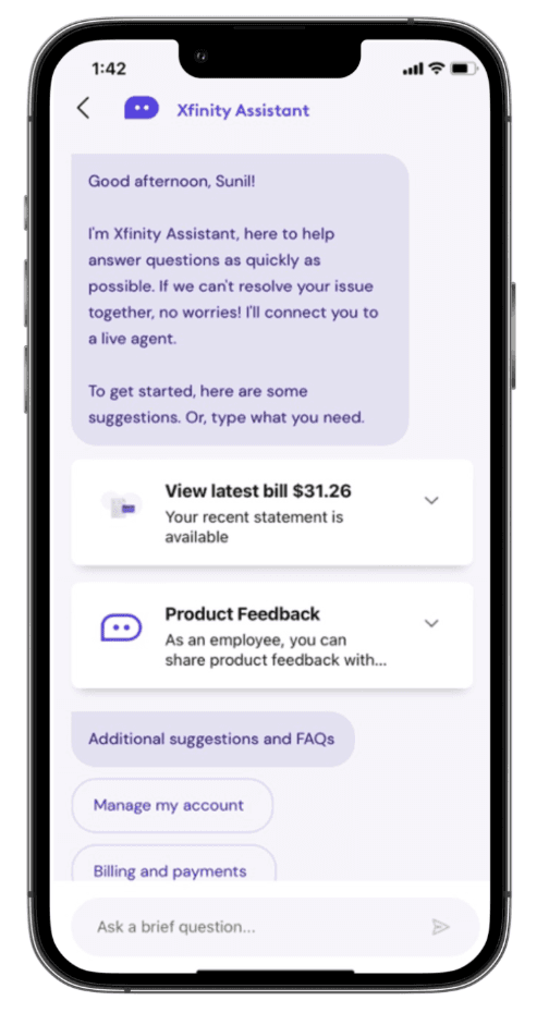
Xfinity Assistant (XA) is Xfinity’s in-app chat support tool. Its welcome screen greets customers with a mix of predictive cards and quick-action buttons meant to get them to help fast. But product teams suspected the screen had become too busy to do that well.
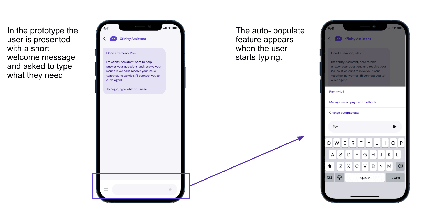
I helped the team build a new auto-populate feature: as a customer starts typing into the chat field, relevant suggestions appear beneath it in real time. The open question was whether this small interaction could double as an implicit teaching tool for XA’s capabilities, and in doing so, justify simplifying everything else on the screen. I also supported the usability research by generating prototypes for testing.
The Problem
The current welcome screen was cluttered. Predictive cards and direct-action buttons competed for attention on first load, making it harder for customers to focus and find what they actually needed.
It also had an unsolved education problem. Earlier research had shown that a dedicated “Learn what XA can do” menu item went largely ignored. Clicking it meant leaving the task at hand, and customers weren’t motivated to spend that time and effort.
Goal
Determine whether auto-populate could carry the weight of both problems at once. Specifically, the research needed to understand whether the feature would:
Help customers discover what XA can do, without adding a dedicated learning step
Teach customers how to phrase requests in ways XA understands efficiently
Feel pleasant and intuitive rather than like extra friction
Create enough of an affordance to justify moving direct actions off the main screen and into the input experience
Prototype & Ideas Explored
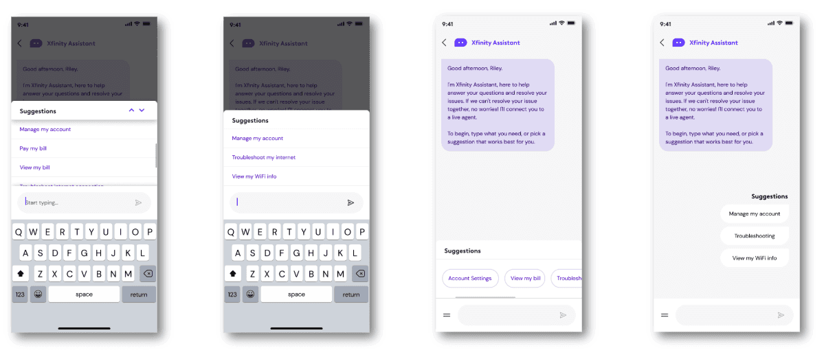
Before settling on a direction to test, I worked with stakeholders to explore several ways auto-populate could surface suggestions — from a persistent suggestions tray to inline chips beneath the greeting.
Learnings from User Research:
Passive education outperforms an opt-in tutorial
It taught people to “speak” XA’s language
“I think I would become a bit lazier and type less. It would be a real time-saver.” - Greg, 50, participant.
Seeing concrete options, instantly, built confidence
“I don’t need a whole conversation, just let me get to what I’m doing.” - Rashetta, 47, participant.
The direction I carried into testing: a short, uncluttered welcome message inviting the customer to type what they need, with auto-populate suggestions appearing only once they start typing.
Designing 0-1 Easy Button - One-click troubleshooting experience
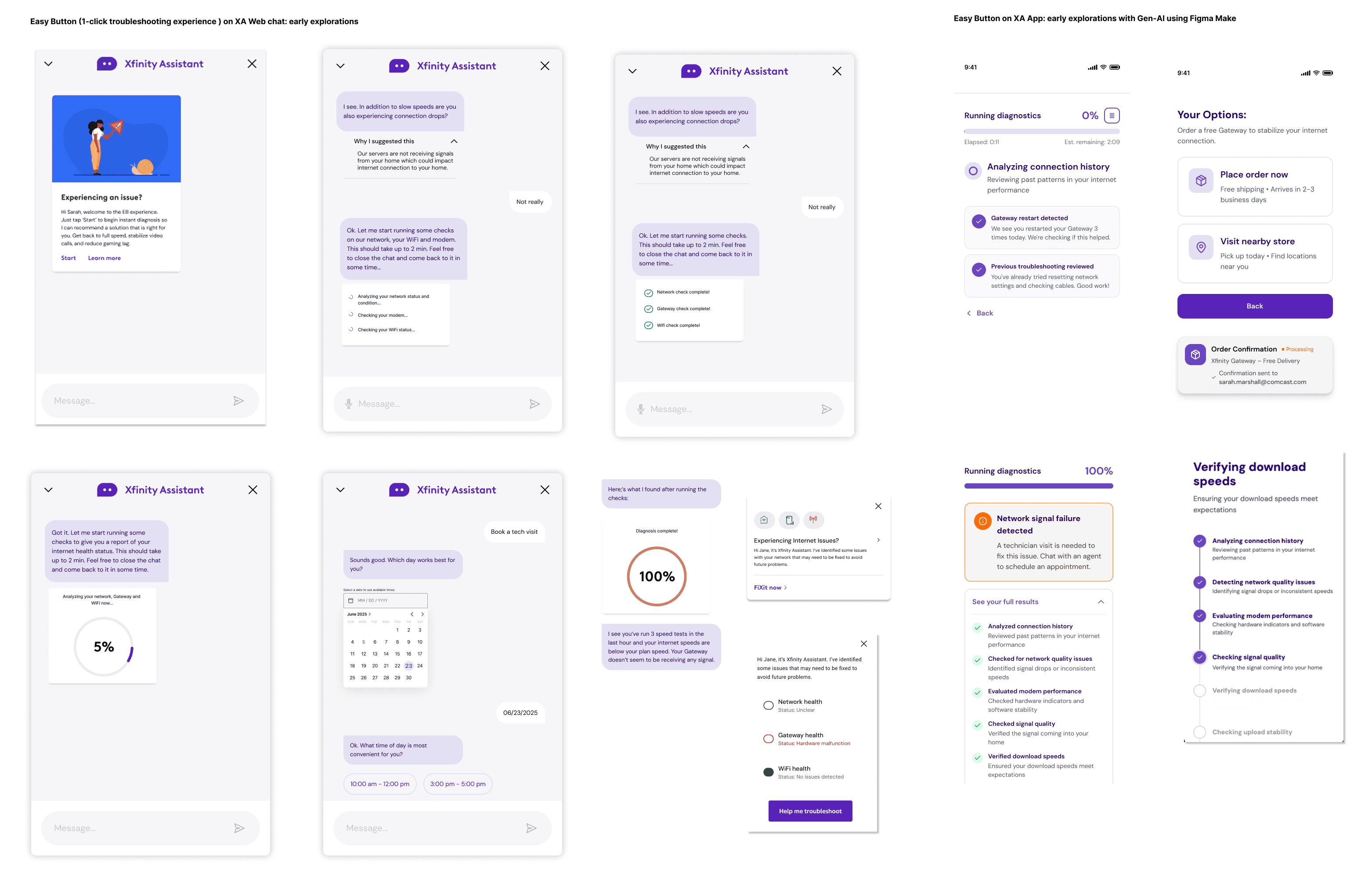
Early explorations began with ideating using existing components in existing troubleshooting journeys leveraging entry points such as predictive cards and app overview cards. Critical UI design components were diagnostic process tracker, diagnostic summary generator cards, calender picker for booking technician appointment, gateway order confirmation and receipt.
Easy Button Press Release:

The Step-by-step troubleshooting process and outcome mapping:

