GOAL: To design a vocabulary app to facilitate learning new languages effectively. The idea is to build a native app for convenient access on mobile phones such that it would enable people to learn on the go.
PROBLEM STATEMENT: How Might We Develop a Vocabulary App that Enables Users to Recall in Context by Taking Control of Their Own Learning Style?
MY ROLE: UX research, Design and Usability Testing
DURATION: 3 months
Process in a Nutshell
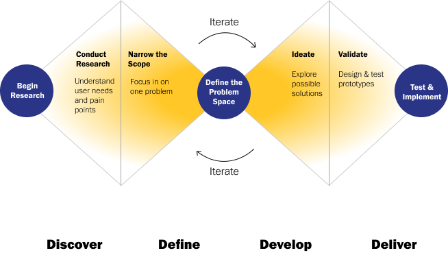
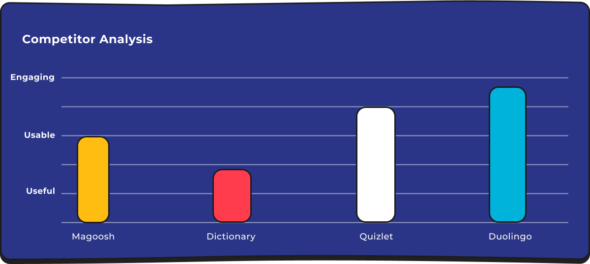
Market Research & Discovery
User Interviews
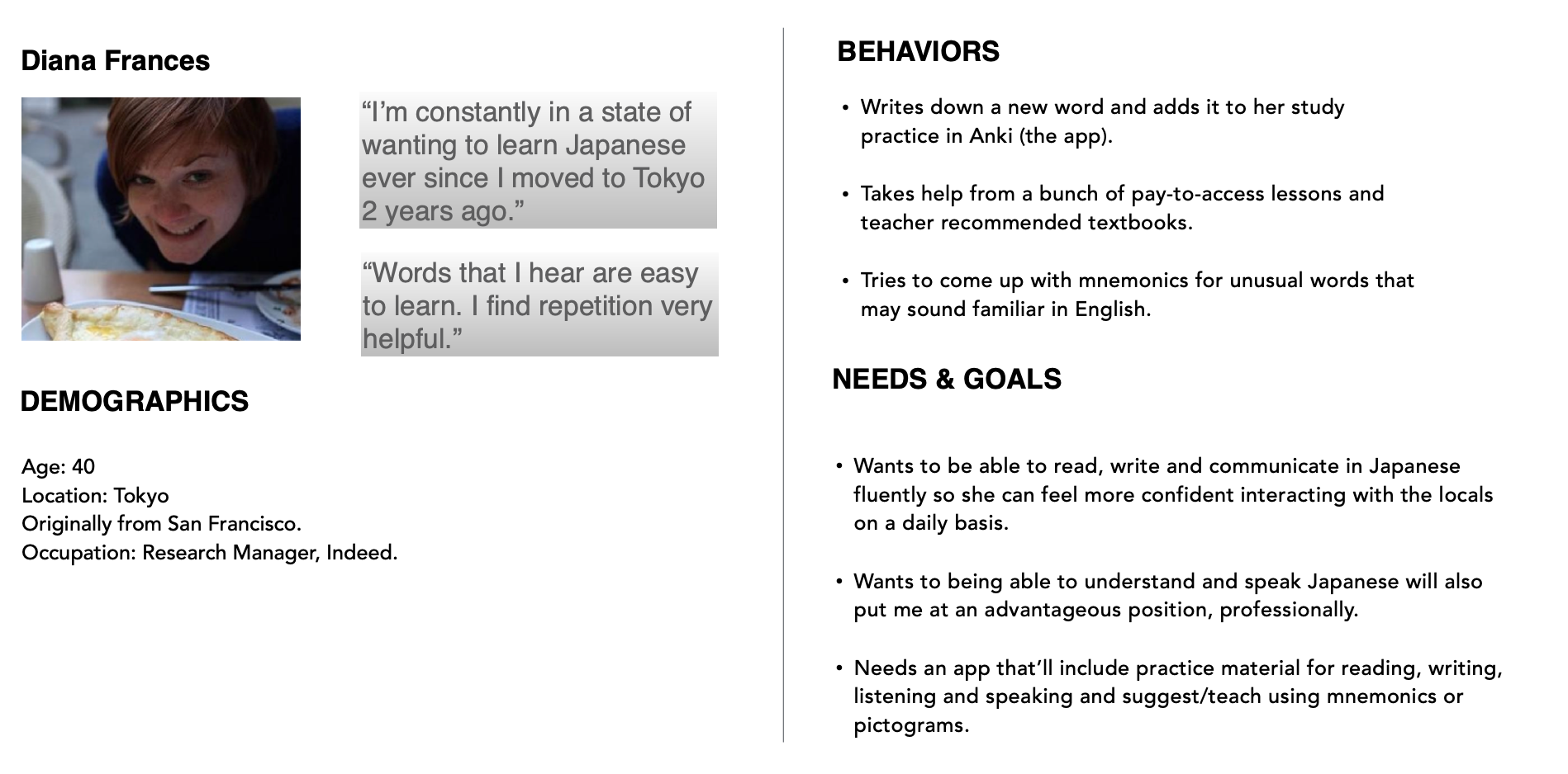
Next, I searched for potential users and interviewed 3 users. Below is an example persona. Based on the data gathered from each user, I listed what each user was thinking, doing & feeling.
User Flows
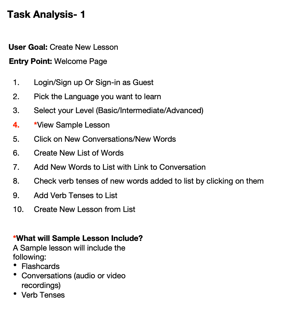
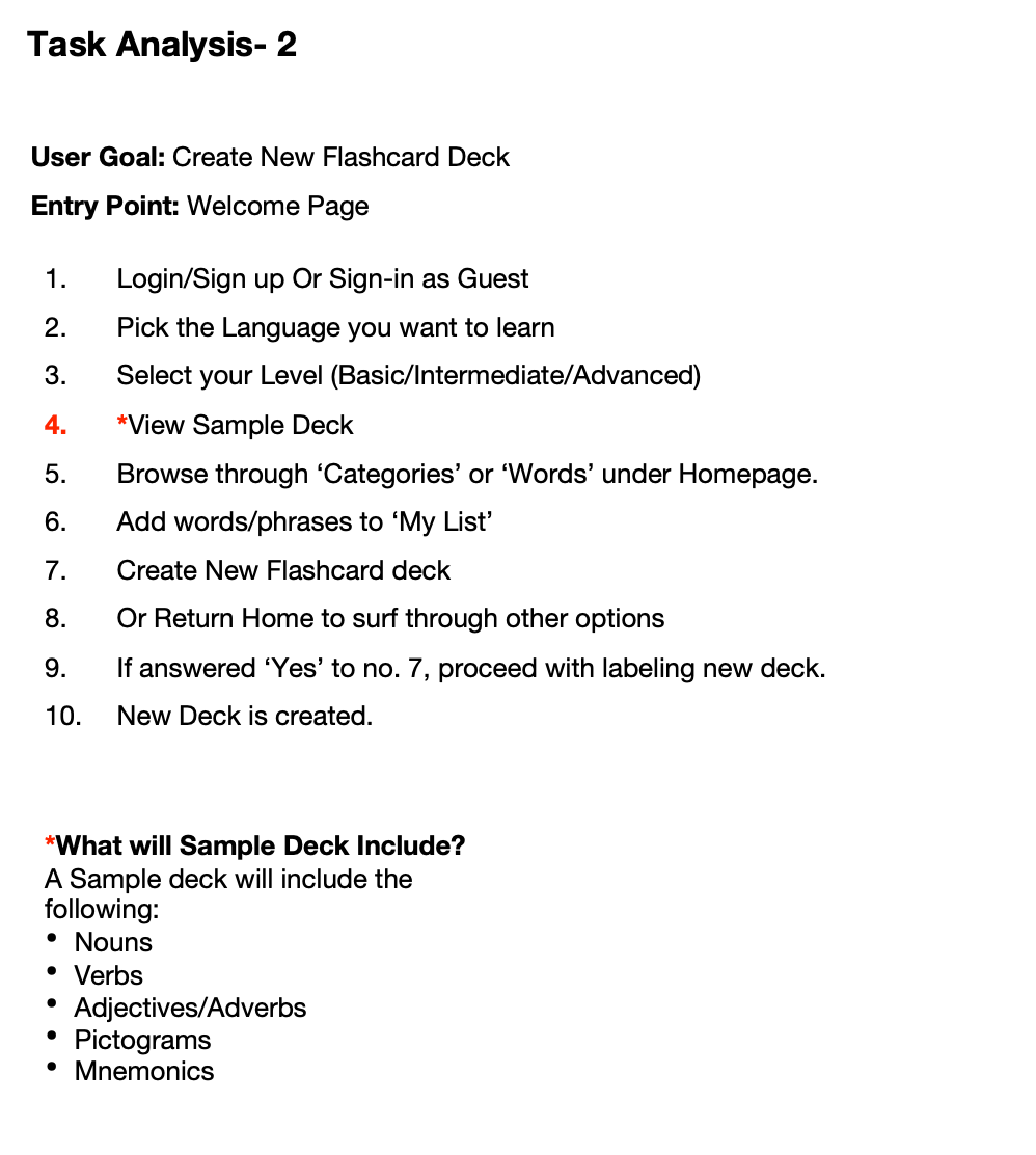
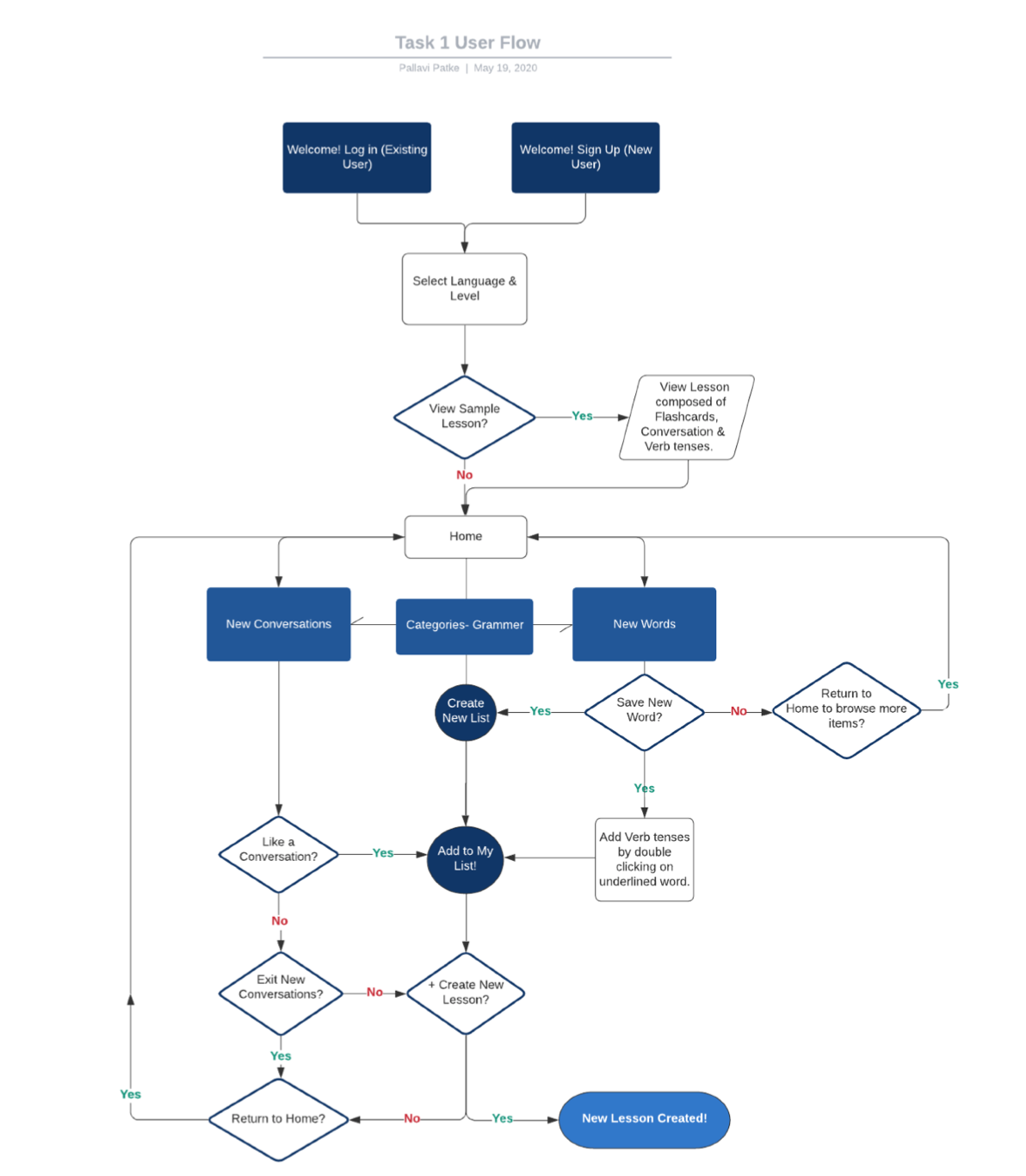
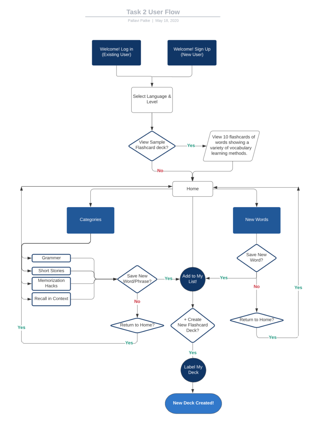
I created 2 user flows, 1 for creating a new lesson and another one for creating a new flashcard deck.
Ideation
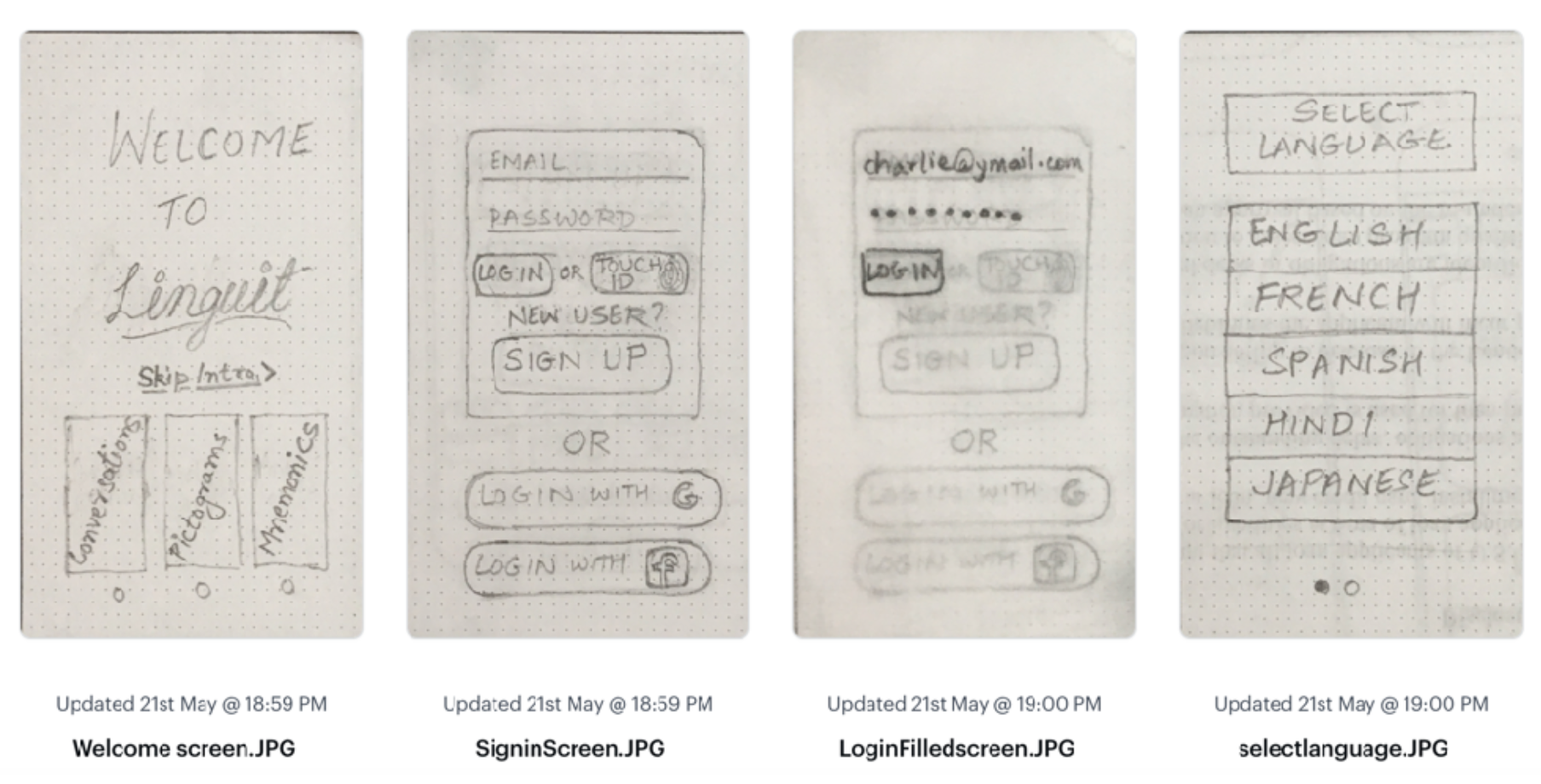
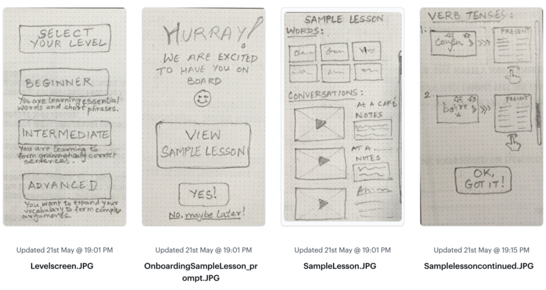
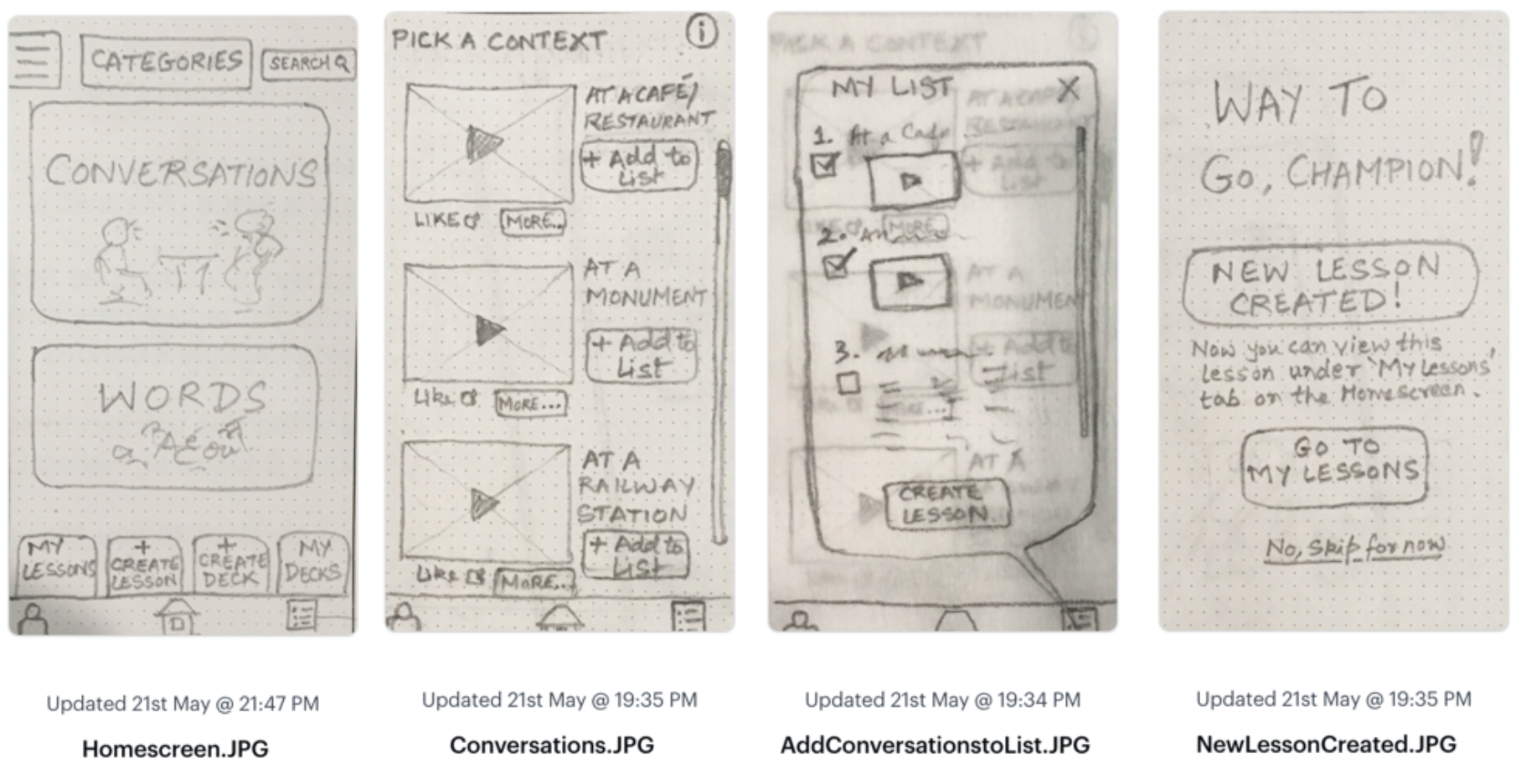
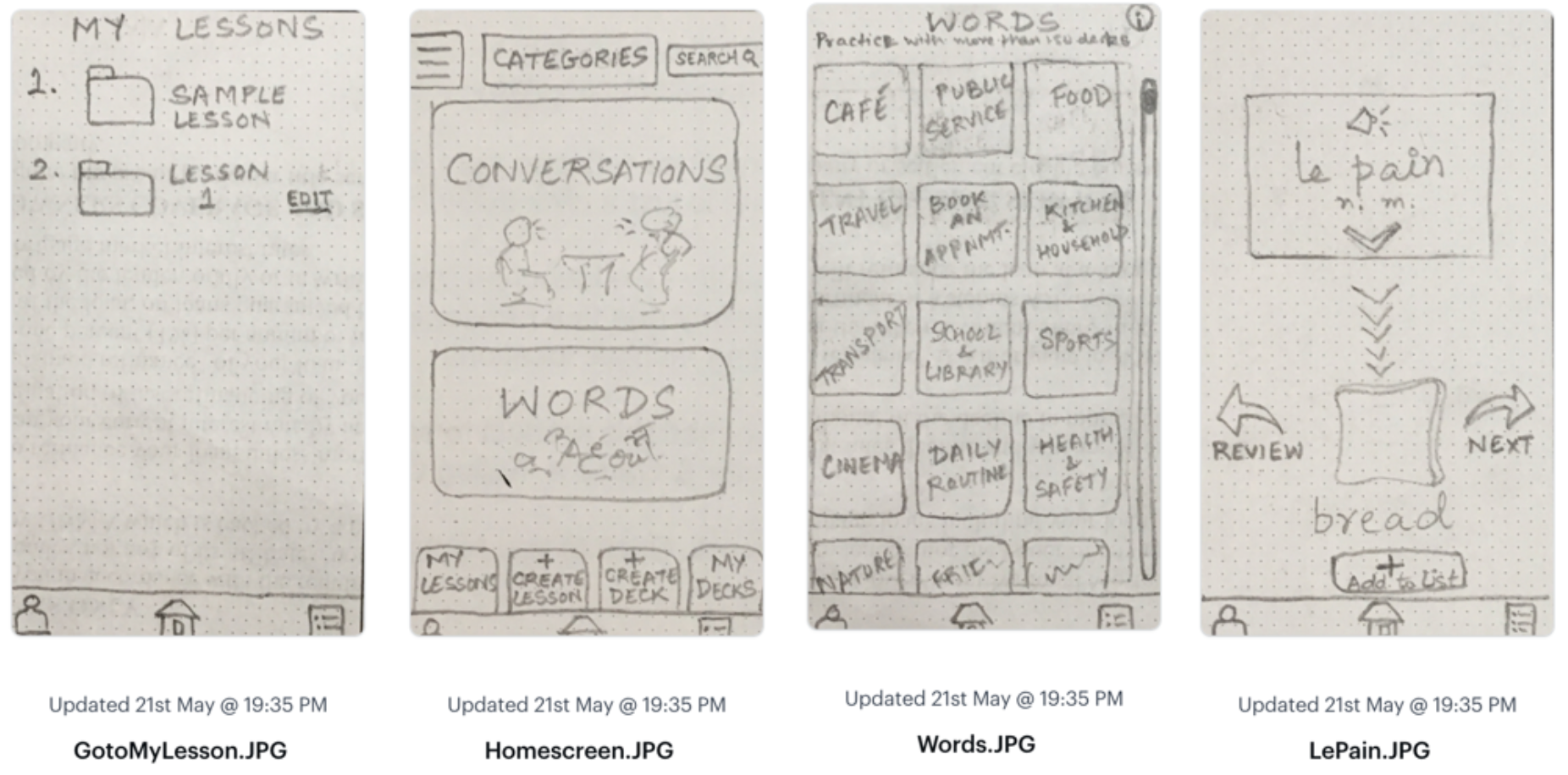
Paper Sketches
I sketched out the first user flow to show how a user at beginner level would navigate through the app ton learn new words or conversations. From my own experience of learning French language through in-person classroom teaching I know that short conversations can really help expedite the learning process as they help you to recall words and phrases in context. I wanted to mirror the same approach in a vocabulary learning app.
Usability Testing
Testing the Low-Fi. Paper Wireframes
I uploaded the paper sketches into Marvel and assigned hotspots on individual screen for the first user flow- Creating a Lesson. The flow basically started with- Selecting Words or Conversations-- Choosing and item to 'Add to List'--Creating a Lesson from the List. I conducted tests with 3 participants. Each session lasted for 10-15 min. For measuring the errors, I used Jacob Nielsen's Error Rating Scale.
Direct Tasks:
1. Onboarding & Sign In
2. Click on the Available Categories to start Learning Words/Phrases
3. Save Liked Items to List
4. Create a New Lesson
Metrics:
0 = I don't agree that this is a usability problem at all
1 = Cosmetic problem only: need not be fixed unless extra time is available on project
2 = Minor usability problem: fixing this should be given low priority
3 = Major usability problem: important to fix, so should be given high priority
4 = Usability catastrophe: imperative to fix this before product can be released
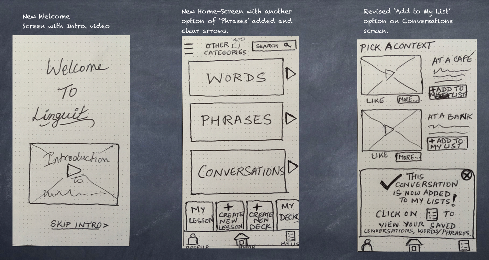
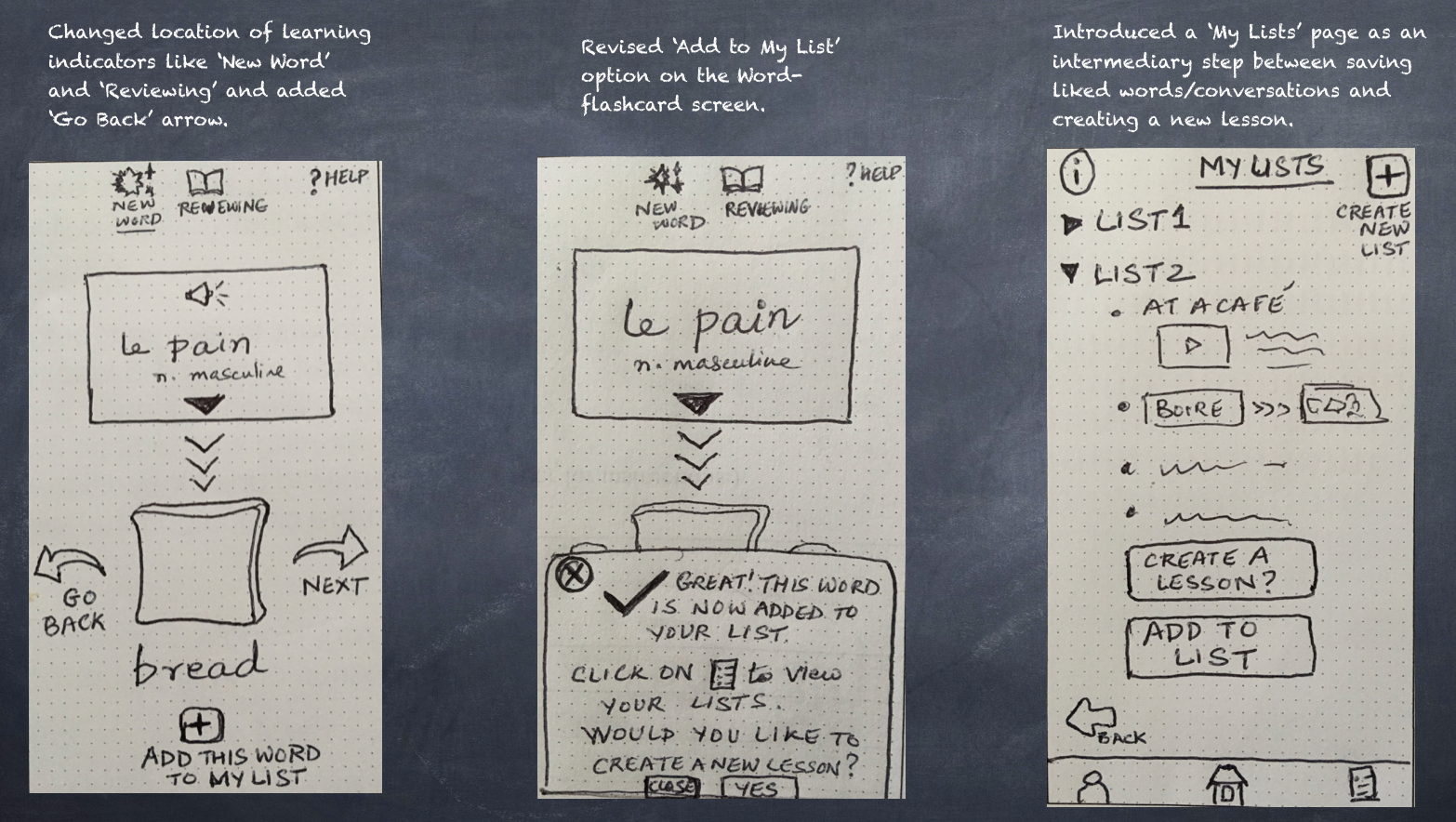
Revised Sketches
Based on my observations of user interactions with paper prototypes, I made the following key changes to my paper wireframes.
Mid-Fidelity Prototypes
The next step was to transfer the drawings onto a higher fidelity version. I used Balsamiq to develop mid-fi prototypes based on each of the 2 user flows.
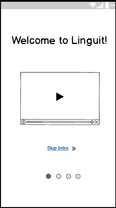
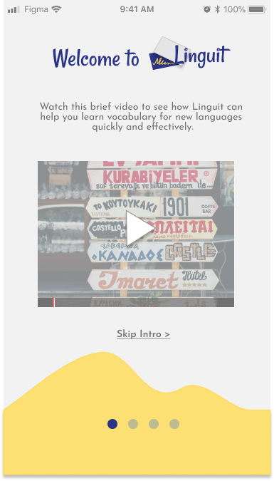
Welcome to Linguit
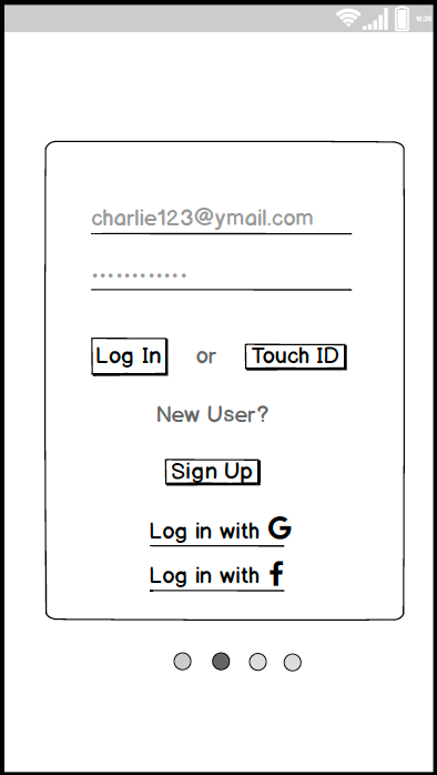
Sign up page
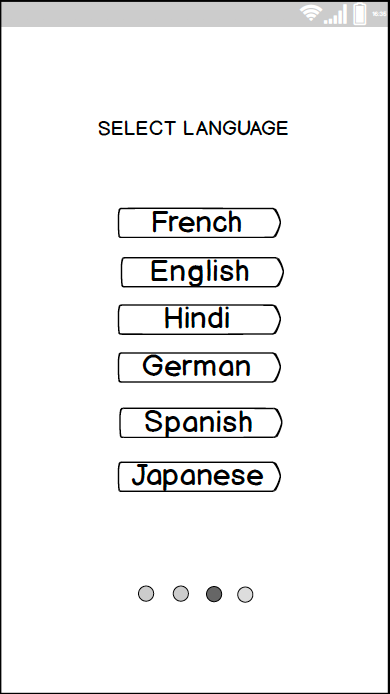
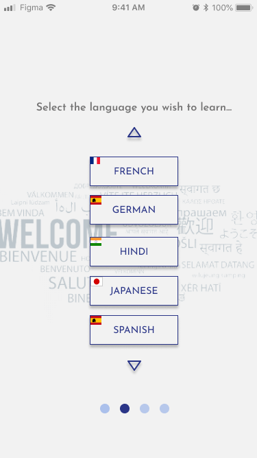
Select Language
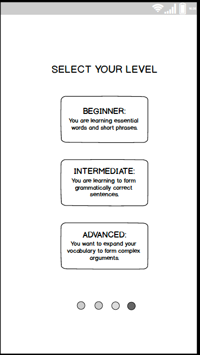
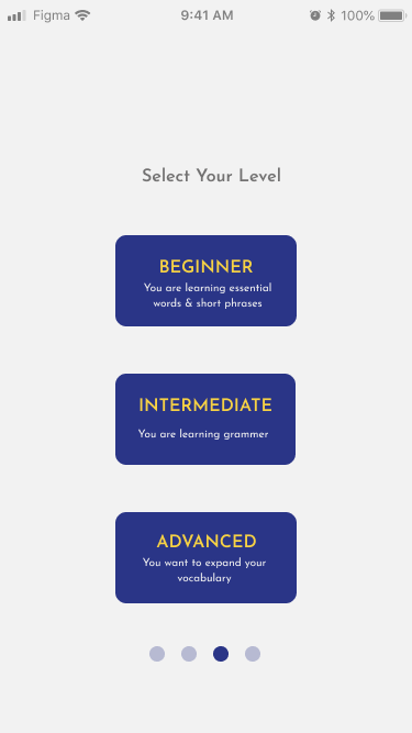
Select Level
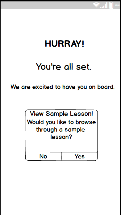
Confirmation
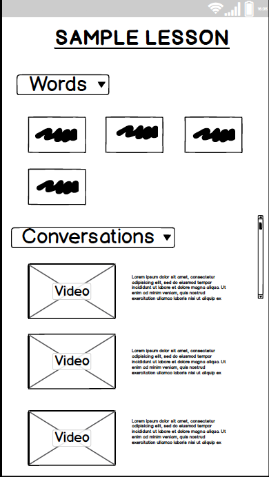
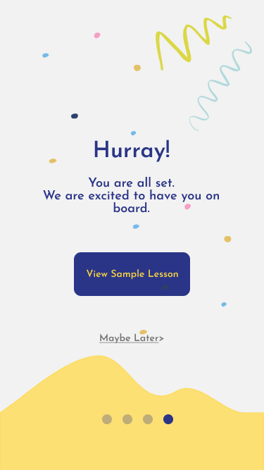
Sample Lesson
Exit Sample Lesson
Video-clip of testing Mid-fi Wireframes
Observations
- There should be a "Back" button at the end of the Sample Lesson.
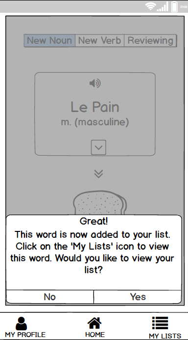
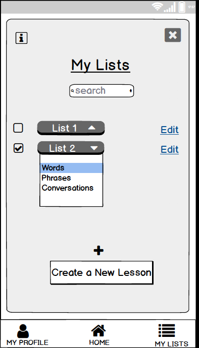
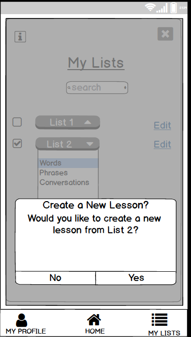
- Having both- the 'List' and the 'Lesson' were confusing. Most users felt that the two could be combined.
- A few users did not understand the significance of ‘My Flashcards' vis a vis 'Create New Decks' on the home page.
- All users would like and easier and quicker way to practice the items that they have saved.
- All the users loved how they were asked to select 'levels' at the time of Onboarding.
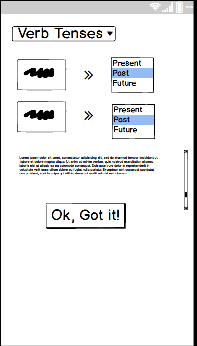
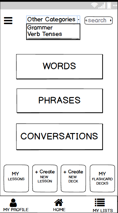
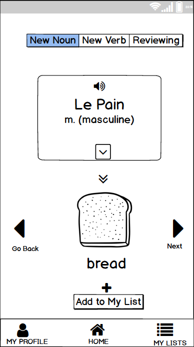
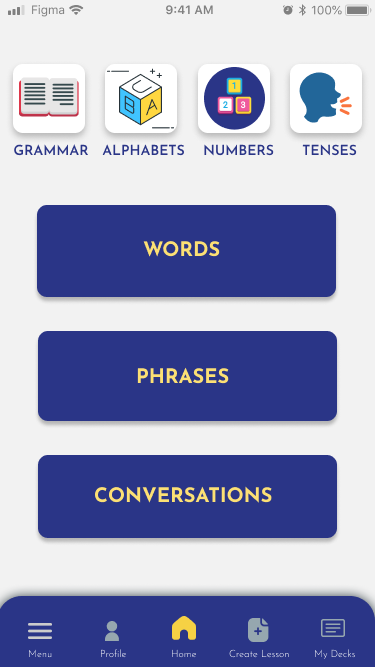
- They liked how learning was split into 3 main categories- Words, Phrases and Conversations
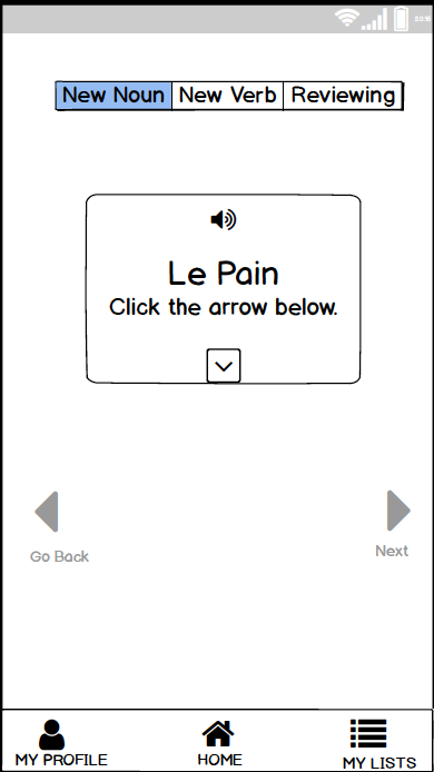
- Pictures and visuals could be helpful and make the app more interesting and attractive.
High Fidelity Prototypes
Onboarding
Next Steps
- Flesh out the remaining user flows in high fidelity
- Continue testing them out with more users
- Hand-off to developer