Designing a User Experience for Expedited Estimation of Pre-Owned Household Items
OVERVIEW: In the dynamic world we live in, people are constantly on the move, either because of a change in their status, or a change in job and or simply due to want of a better lifestyle. In such cases people are often looking to give away used but good quality stuff which maybe they've only bought a couple years ago or stuff that they have not had much use of. Tastes change and maybe they just grow out of it. True, donation is an option, but does it have to be the only option? With this in mind I decided to explore a potential solution in the form of an online marketplace that expedites product appraisal quick & easy, for both buyers and sellers. The idea is to let the platform do all the market research for you for a certain object and suggest a fair price or even potential buyers. For starters, I decided to focus only on the objects one encounters at one's home.
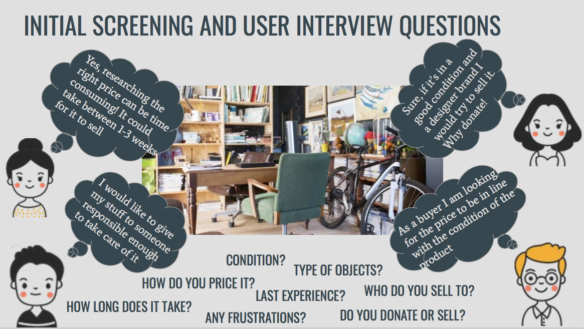
PROBLEM STATEMENT: The problem I suspect is that when people are looking to dispose/sell off their household items, most people find it difficult to estimate their value.
GOAL: Design a prototype for an online web platform for selling secondhand household items.
User & Market Research
Objective
The overall project objective is to facilitate people’s experience of determining the ‘right’ value of any product that they wish to sell. The product may or may not have been used by the seller himself/herself. The idea is to develop a mechanism and design a service that performs the function of value estimation and appraisal so as to elevate the status of the product being sold, in the eyes of the buyer. This will in turn encourage interested buyers to see value in their purchase and choose wisely, thus effectively providing for a win-win situation for both the seller as well as the buyer.
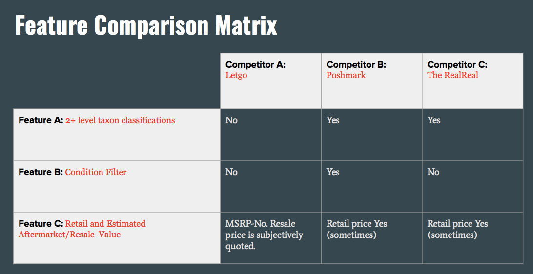
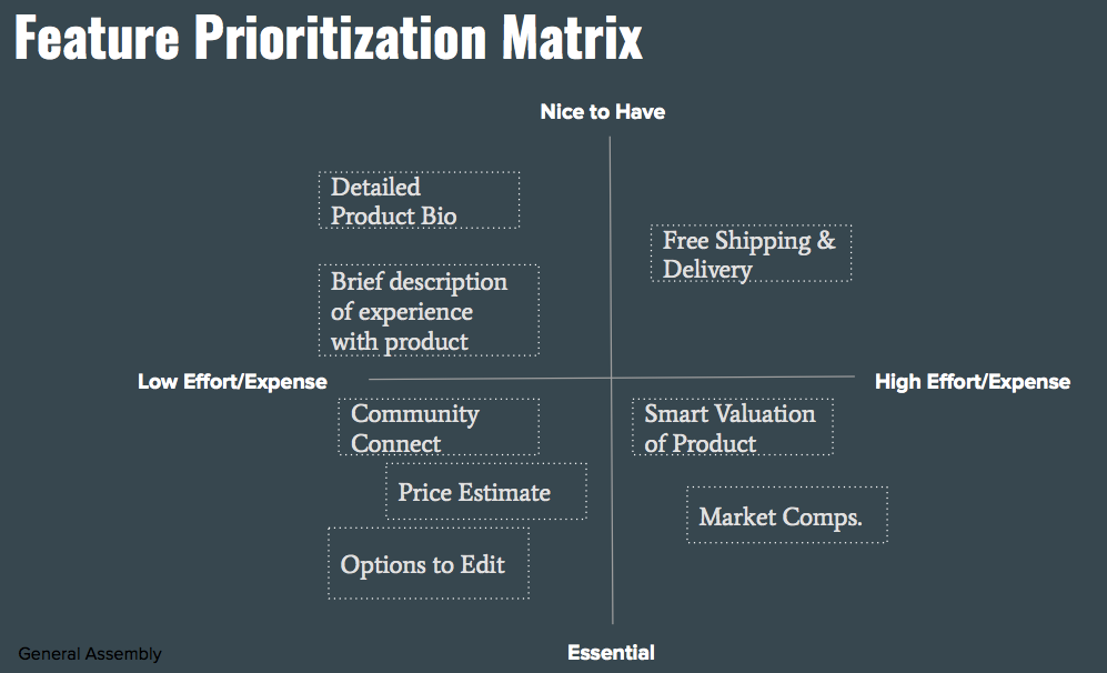
Competitive Analysis & Feature Prioritization
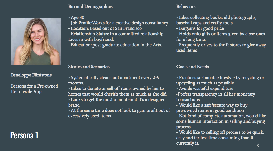
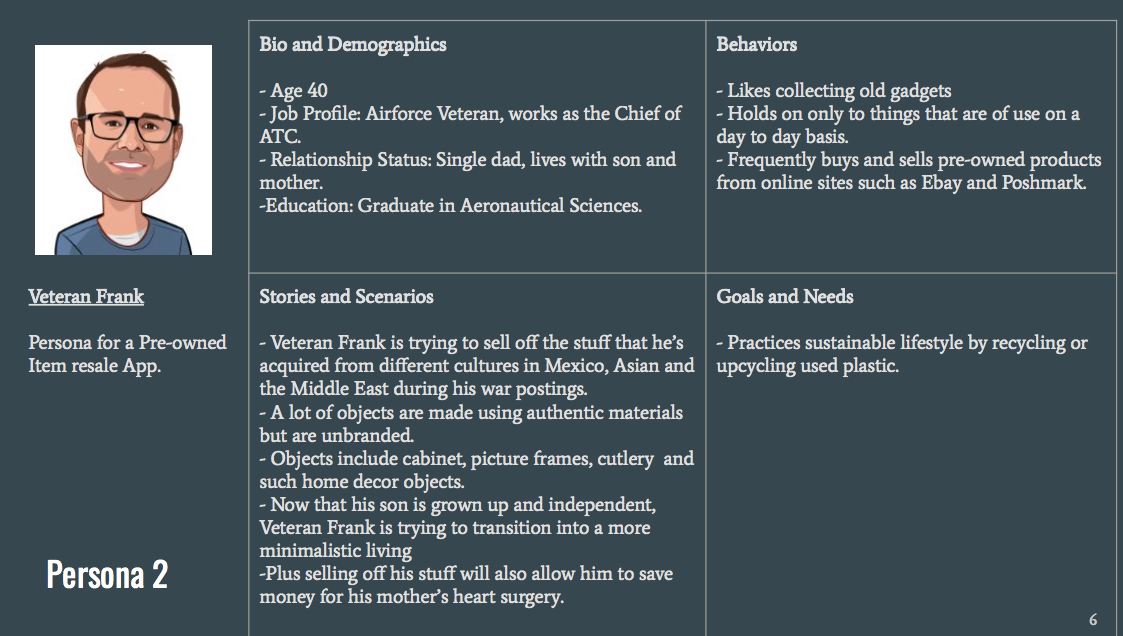
Personas
My target users include people who are driven to reduce waste, sustainably recycle items of daily use and those that believe in extending the life cycle of the items they use or own. They fall mostly between the age range of 20-45. Targeting users with similar motivations helps me to systematically assess their practices and group their behavior in categories that are critical to my user experience study.
User Research Analysis
User Goals
1. Transparently communicate every product’s monetary as well as affective worth unambiguously to individuals who are interested in buying used or pre-owned items.
2. Put the onus of collecting purchased items from the seller upon the individual buyer through a feature called ‘Community Connect’ so that the seller does not need to be concerned with dropping off his/her item.
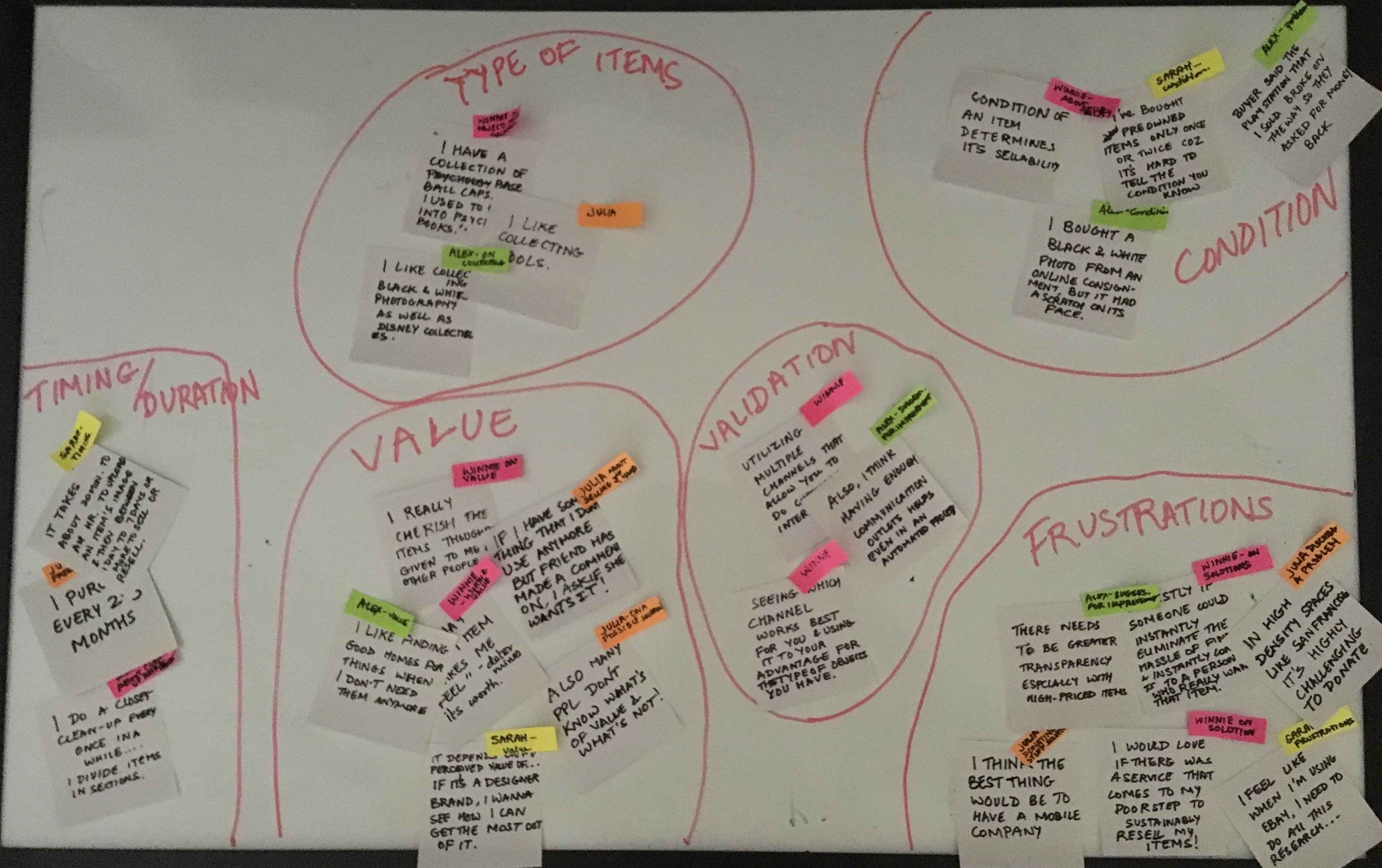
Affinity Map
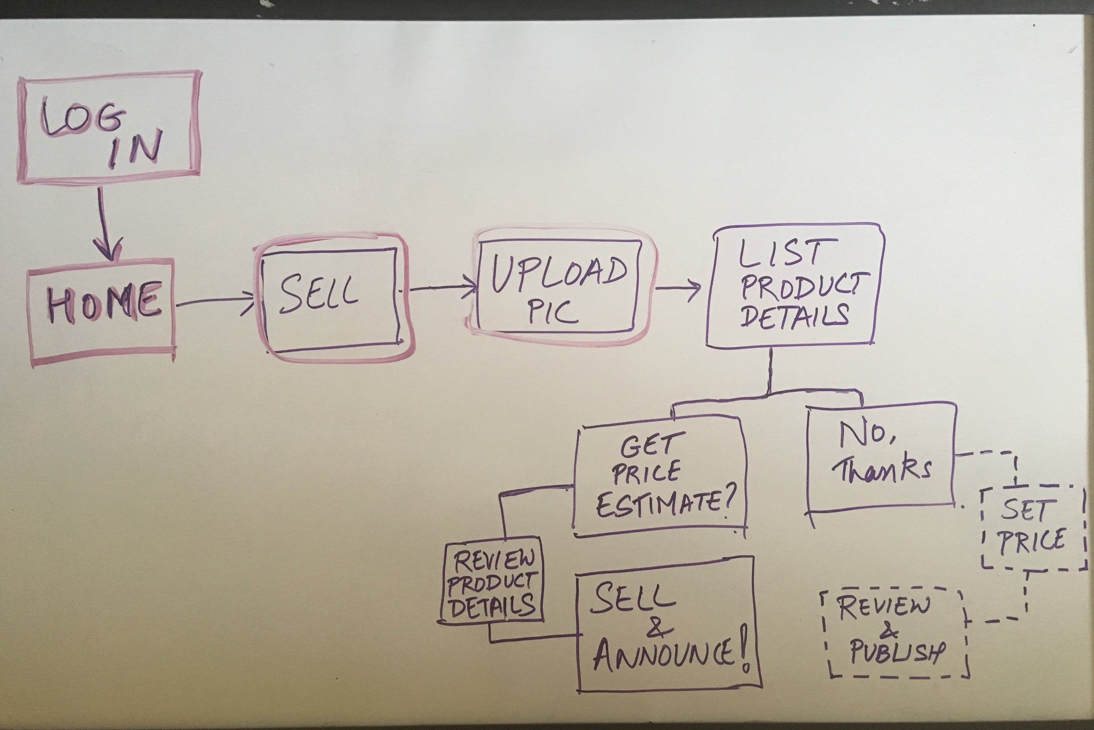
User Flow
Wireframes & Prototypes
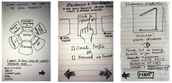
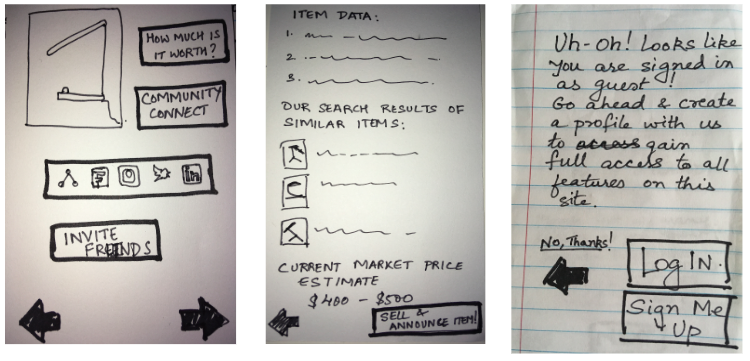
Paper Sketches
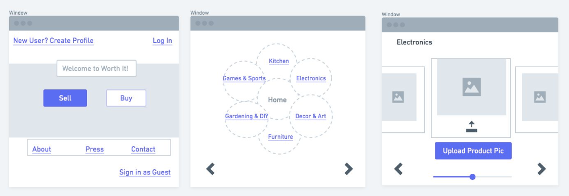
Low Fidelity Prototypes using Whimsical
Initially, I planned to include both buying and selling operations, which is what you'll see in these low-fi prototypes below. But then the user-flow and sitemap were beginning to get complicated. So I decided instead to focus on my MVP, by concentrating solely on the 'selling' feature.
Usability Testing
Usability Test Results
User observations & recommendations were as follows:
1. Is it necessary to choose log in options on the Home screen?
2. Where does guest sign in lead to?
3. Category buttons need to be made clear.
4. Links vs. non-links need clarification.
5. One of the users found it confusing to see the button option of ‘Add new product’ on on Uploading pics screen
6. Another user would have liked to have the button option of ‘Adding new product’ on the Product Details page.
7. There is no button to edit the suggested price and set my own value.
8. User mistook, search icon for zoom icon.
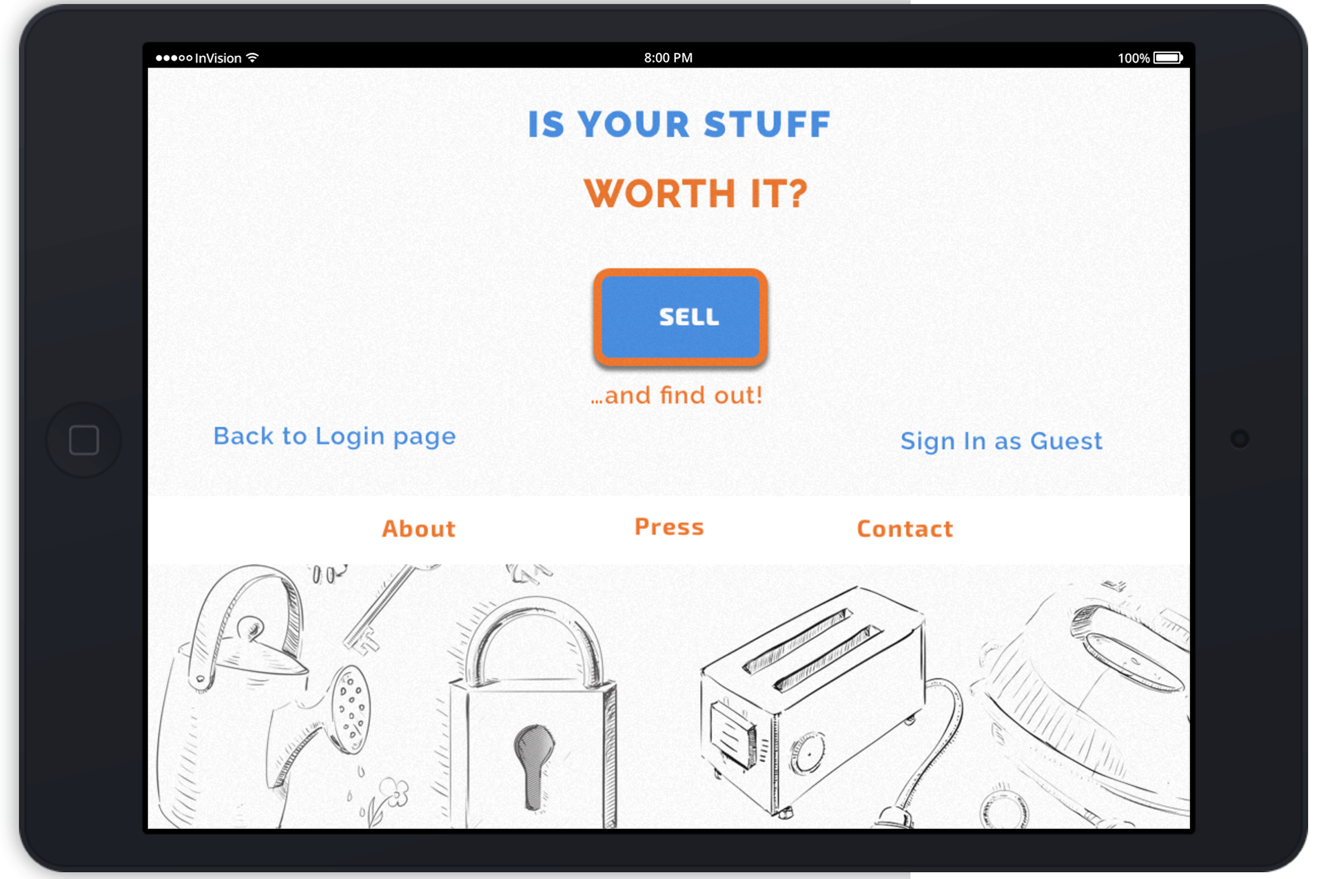
Key Screens
Based on the revisions of low-fi wireframes, I went on to develop hi-fi prototypes of a responsive website for a tablet. Following are some of the key screens designed for a responsive website titled, Worth it! Here's the link to Clickable Prototypes showing the full range of high-fidelity prototypes.
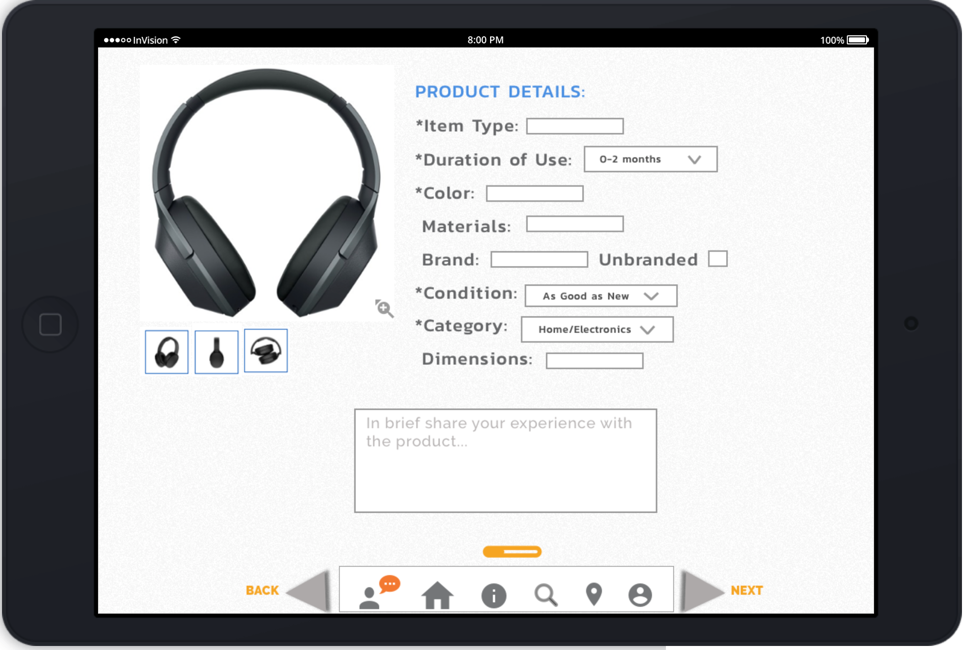
Enter Product Details
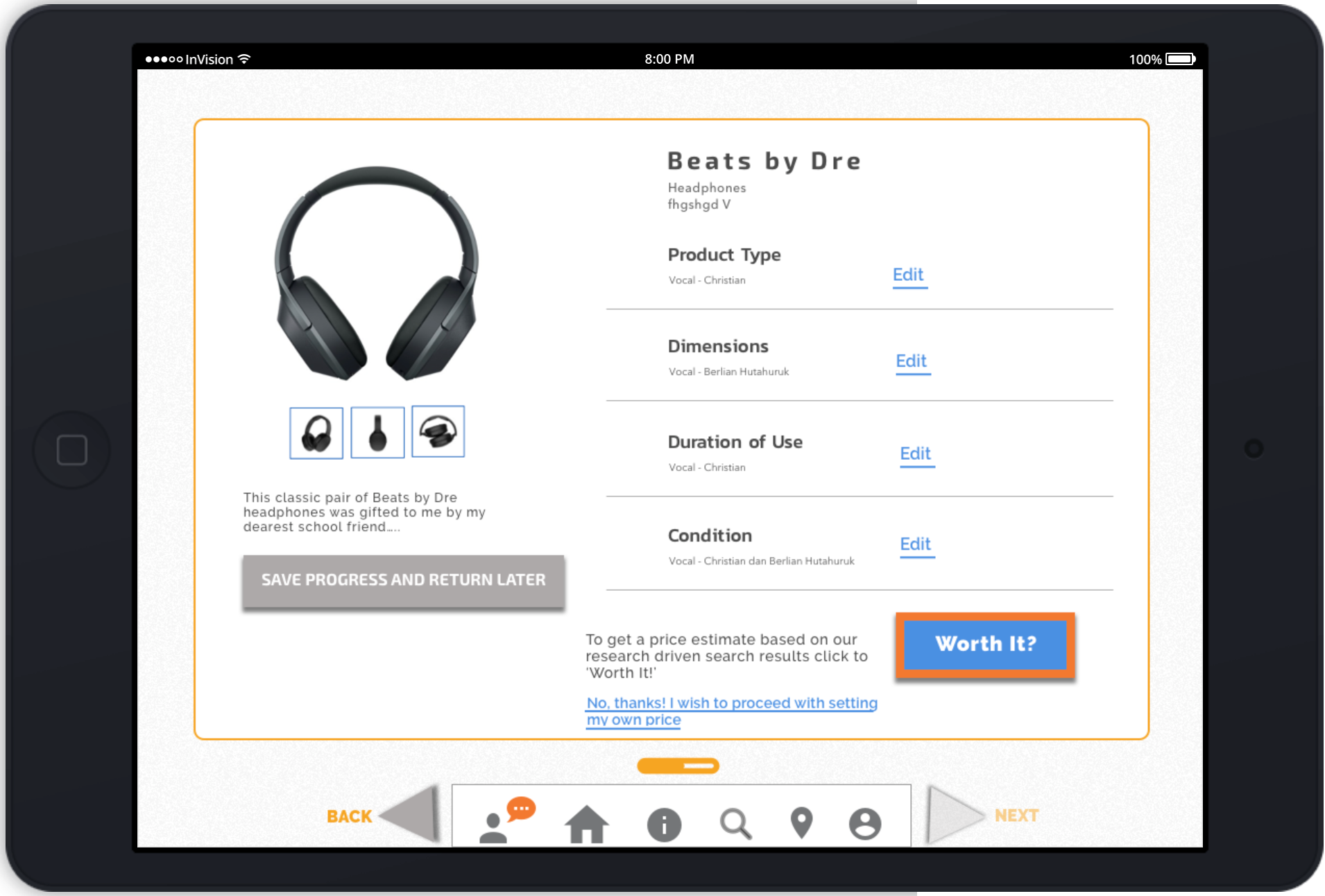
Click 'Worth It' to quick estimation & appraisal of product value.
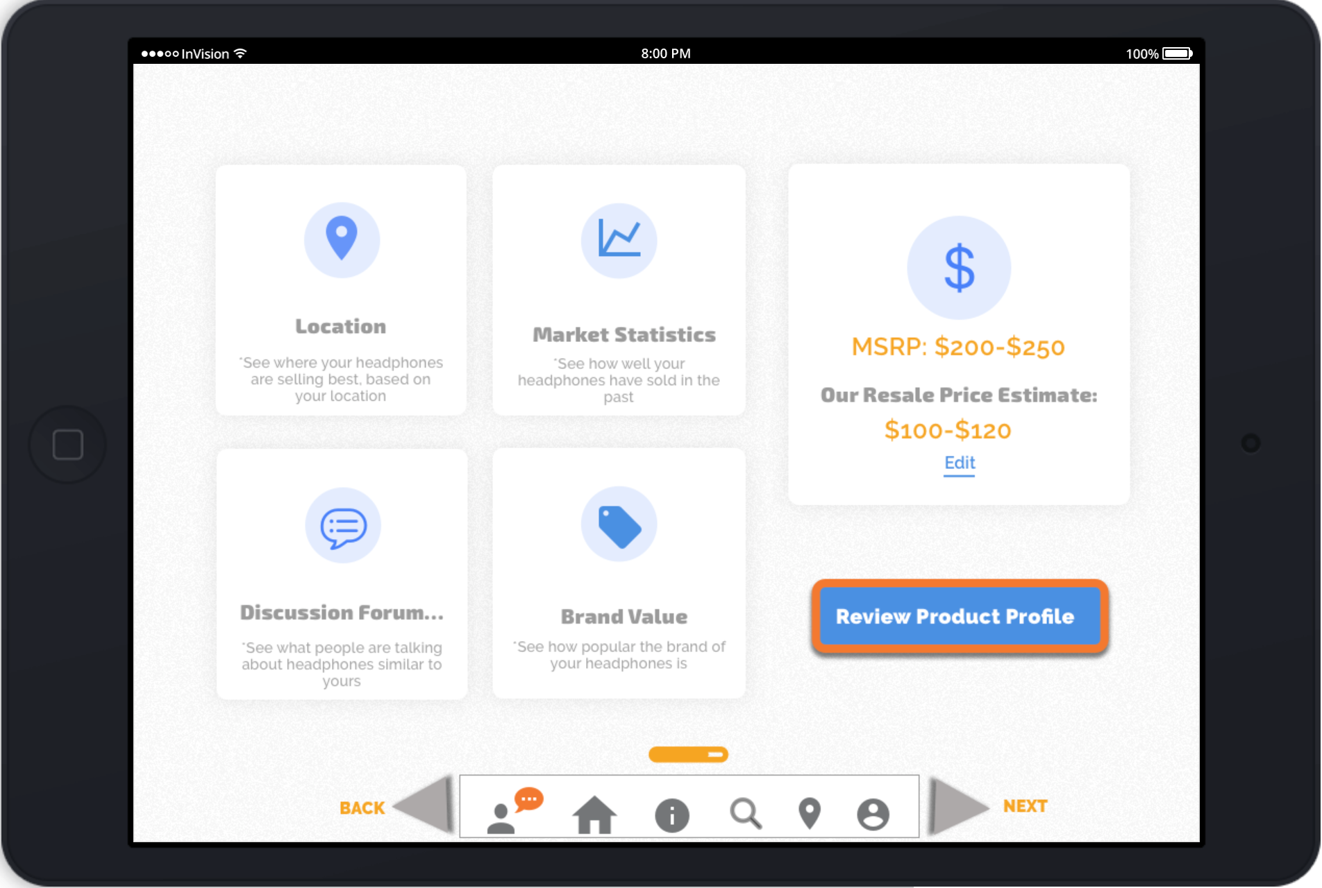
Review Estimation Details &Product Profile
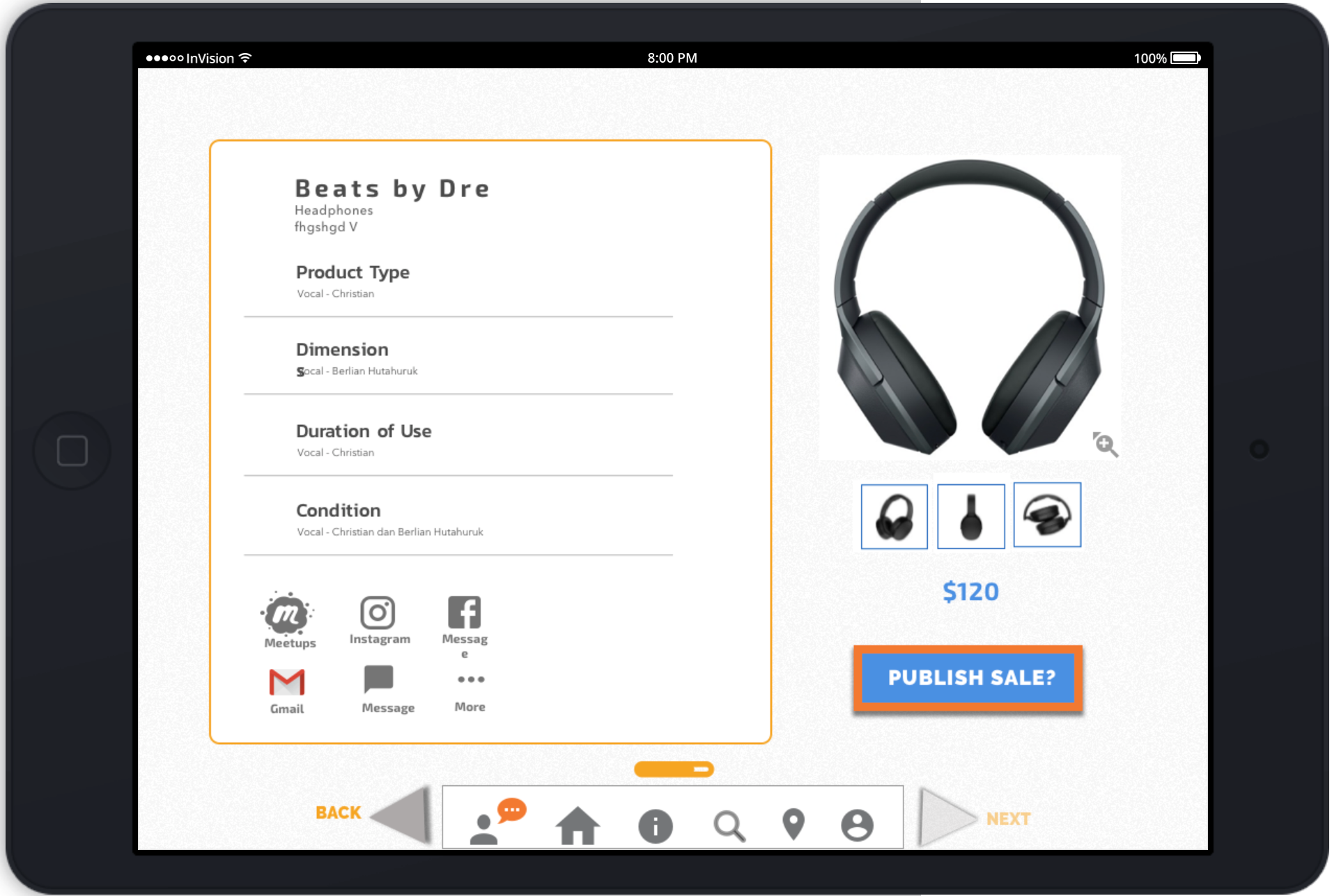
Confirm Resale Price & Publish Sale
Usability Testing of High-Fi Mock-ups
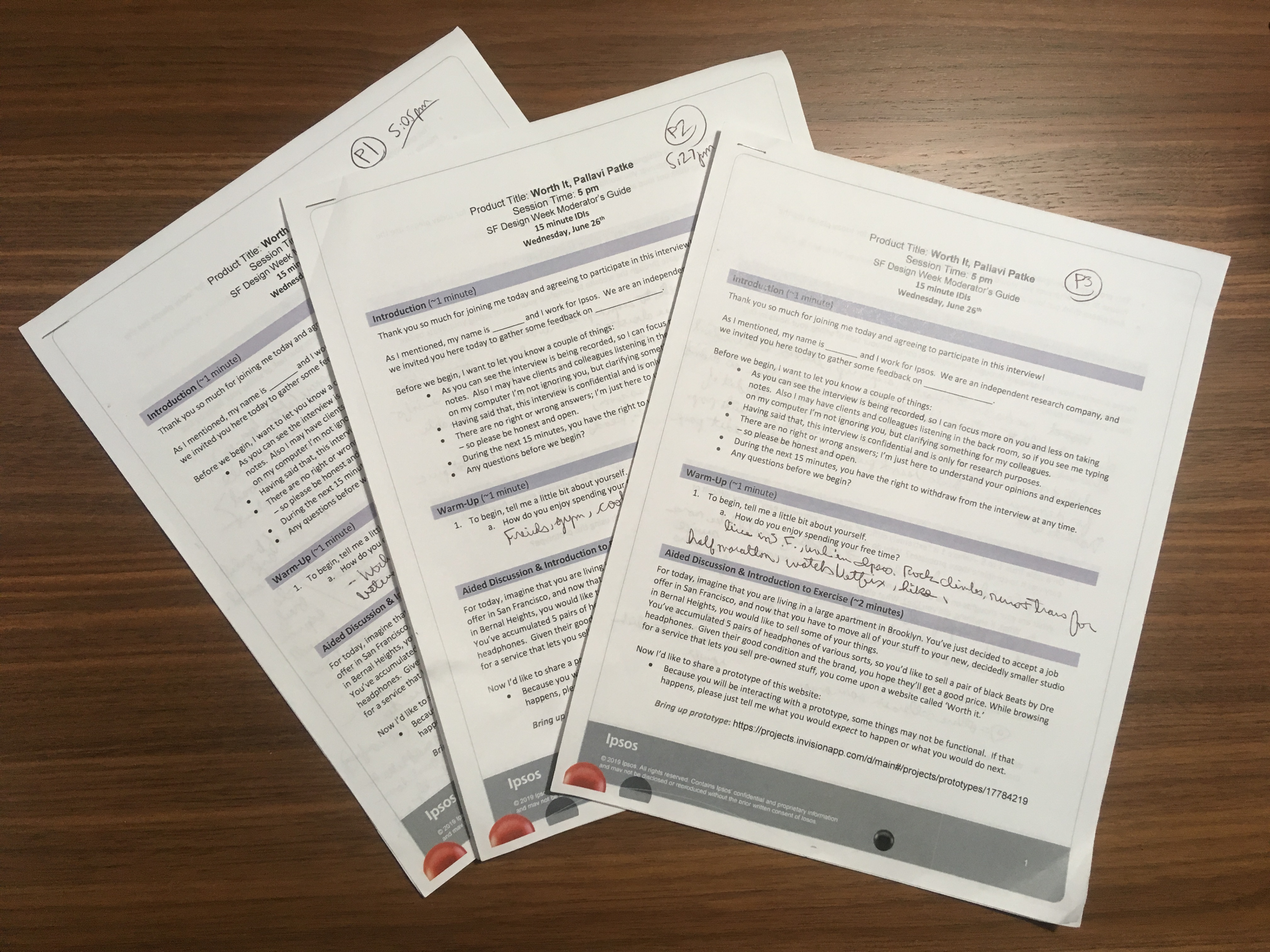
In order to measure the rate of success of this website, I collaborated with IPSOS (a market research company) to prepare a task scenario and conducted usability test with the help of a moderator on their team of UX researchers.
Click on the links below to see video clips of two participants testing my product. Two out of 3 participants rated my prototype at 4, whereas one participant rated it as 2 on a scale of 1-5 (with 5 being the highest).
Suggested Improvements
1. User was unsure of what 'Power source' to include.
2. User would like more explanation on what would be considered branded vs. unbranded.
3. User kept accidentally clicking on the back arrow button or the front arrow buttons while using navigation bar at the bottom.
4. User Remarks: "I tend to always do my research before I dive into something, so I guess I would like to see what the company is about in the 'About' section."
5. User Remarks: "I like how it's giving you a task and then it goes on to the next task."