Overview
Pundit is a native & responsive web app that aims to deliver speedy solutions to household object purchase, replacement and/or malfunction. It does so by employing cutting-edge object recognition technology to match object-issues with the right expert who can provide the best advice or service. For the purpose of this case study I have only focussed on designing the customer-side of the native app.
GOAL: To develop an MVP version of a mobile app that’ll allow homeowners to instantly start a project, connect with the right experts, manage, share and send ideas through their mobile.
MY ROLE: End-to end UX Design. From researching market opportunity to interviewing users and translating qualitative and quantitative insights into visually appealing interactive designs.
TEAM: 3 persons- Myself, my mentor and tutor from CareerFoundry
DURATION: 6 months
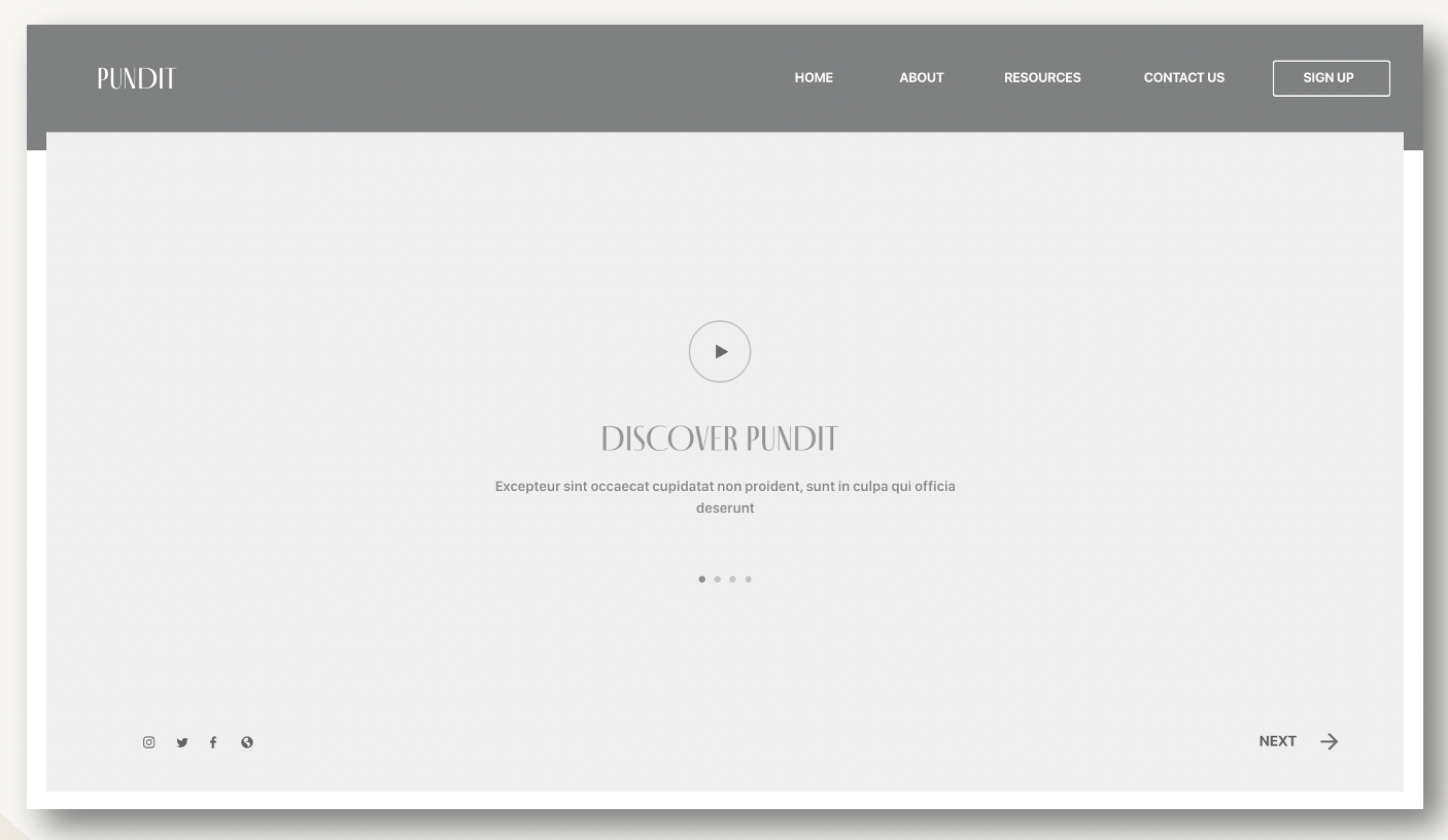
A Video Walkthrough
Problem
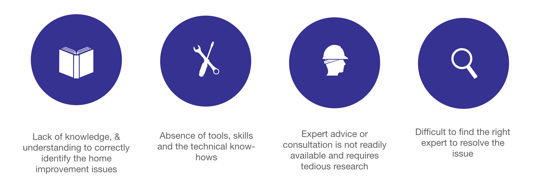
Homeowners need a way to effortlessly identify the right expert for resolving object-specific problems at home,
because they often face difficulties such as:
Solution
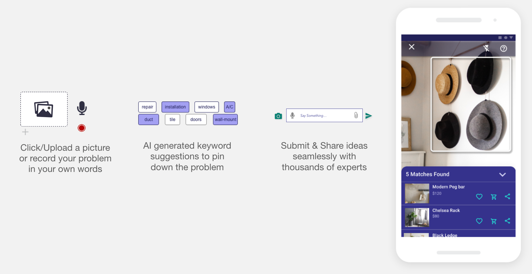
What Makes Pundit stand out?
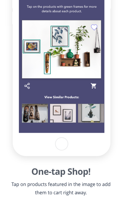
The unique selling point of this app is that is substantially reduces the effort on part of the homeowners to- 1) identify the problem, 2) determine the right expert to solve it and 3) simply seek professional advice. Pundit makes this possible through its cutting-edge audio-visual object recognition capabilities.
Research & Discovery
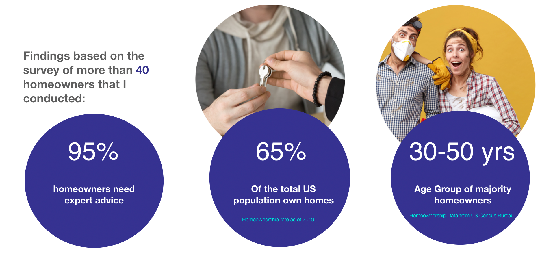
Market Survey
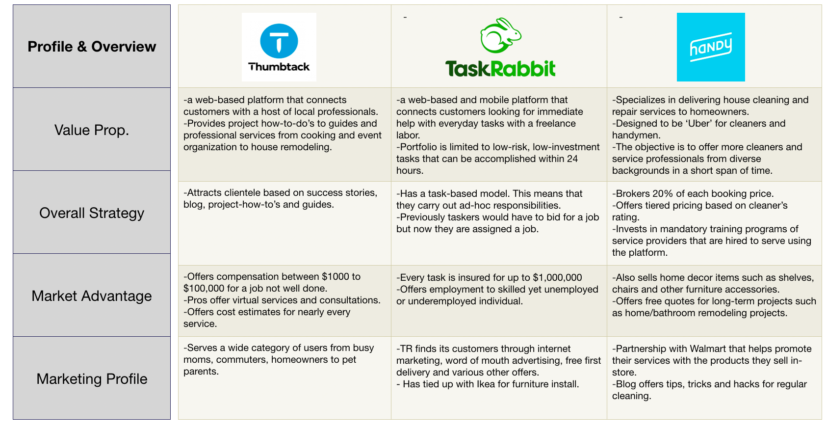
Competitive Landscape
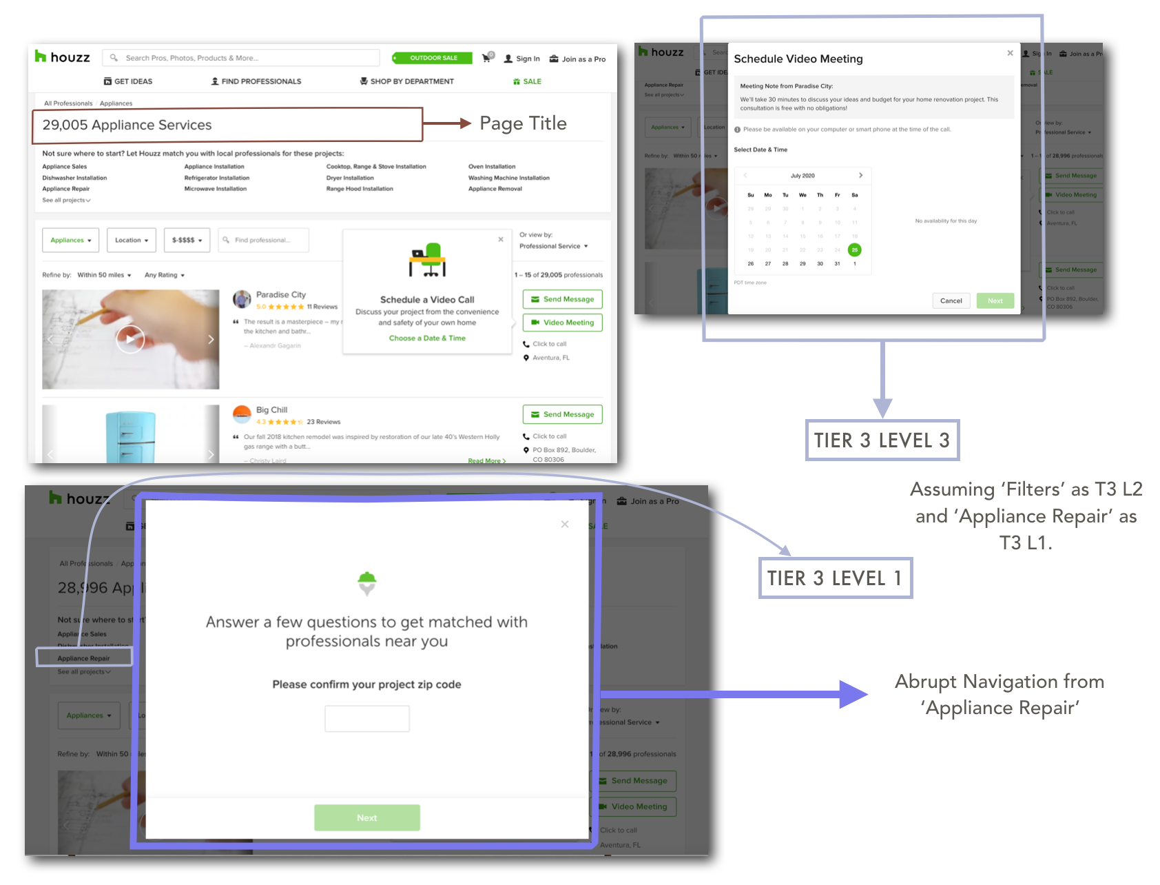
I surveyed competitor apps in the market in order to understand their strengths, weaknesses, usability, layout and value proposition and overall market presence. Further on, I also conducted a content audit of Houzz website and app, which helped to scaffold my findings from competitor research.
Personas
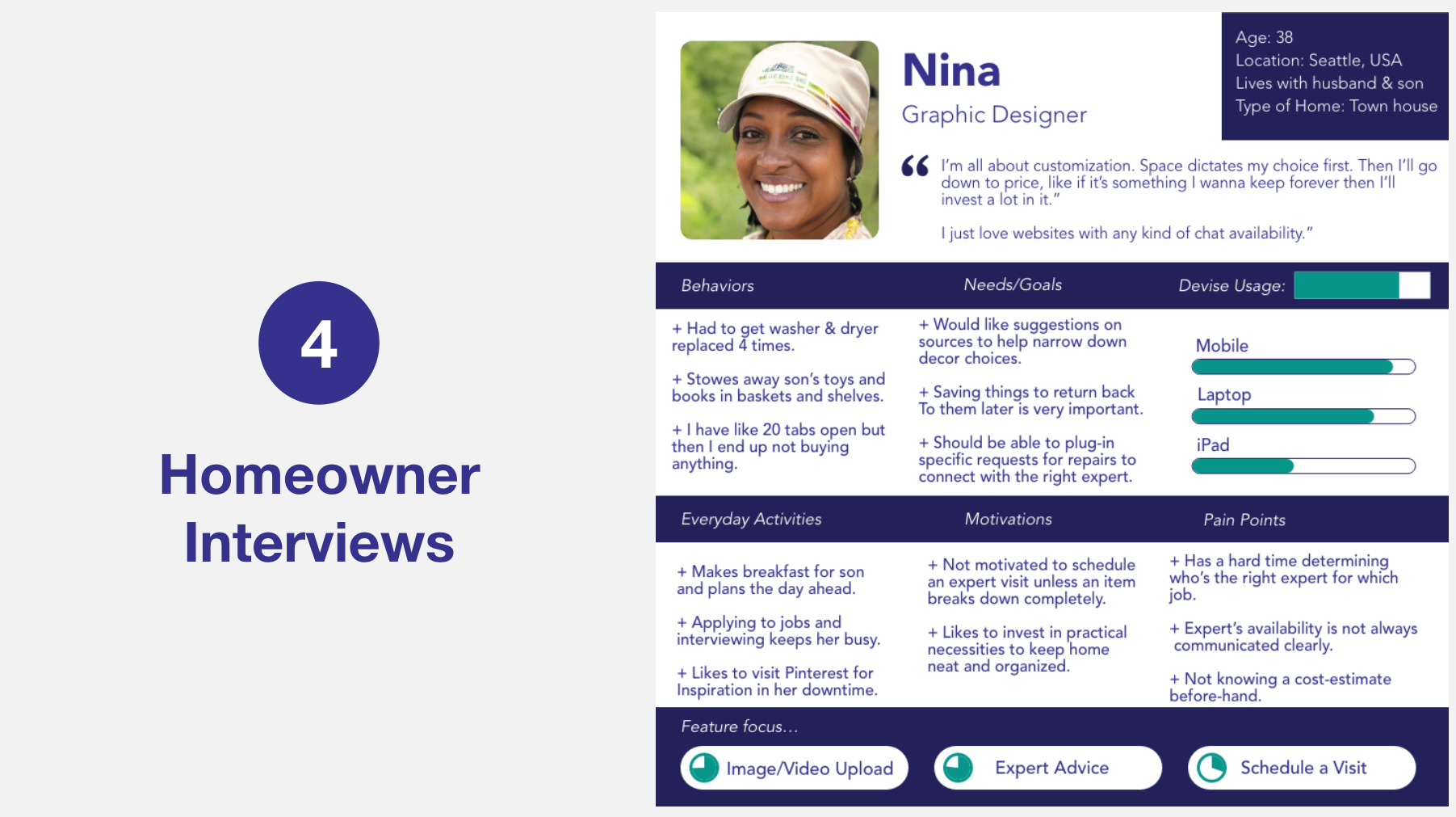
Next, I recruited homeowners from within and outside the US to be interviewed. I wanted to interview homeowners that represented diversity in cultural perspectives and ages/phases of life. Based on my conversations with them I created 3 personas, each of which represents a broad type of homeowner. I listed out their needs/goals, behaviors, everyday activities, motivations, pain points and device usage.
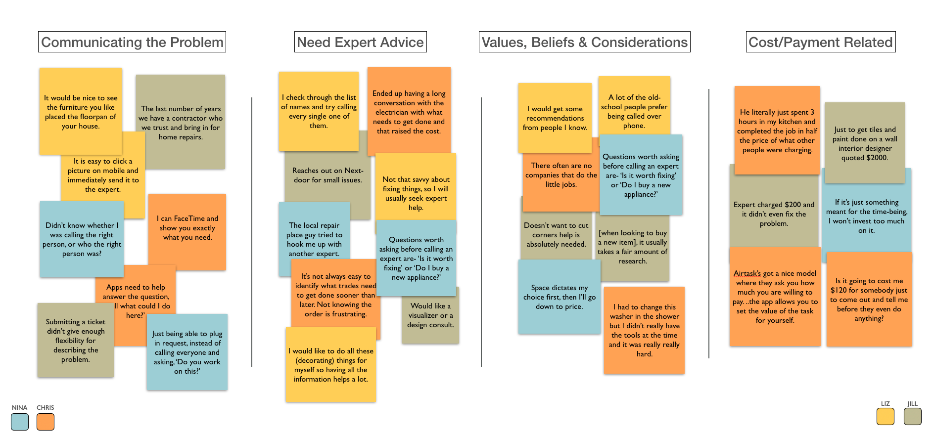
User Research Analysis
Ideation
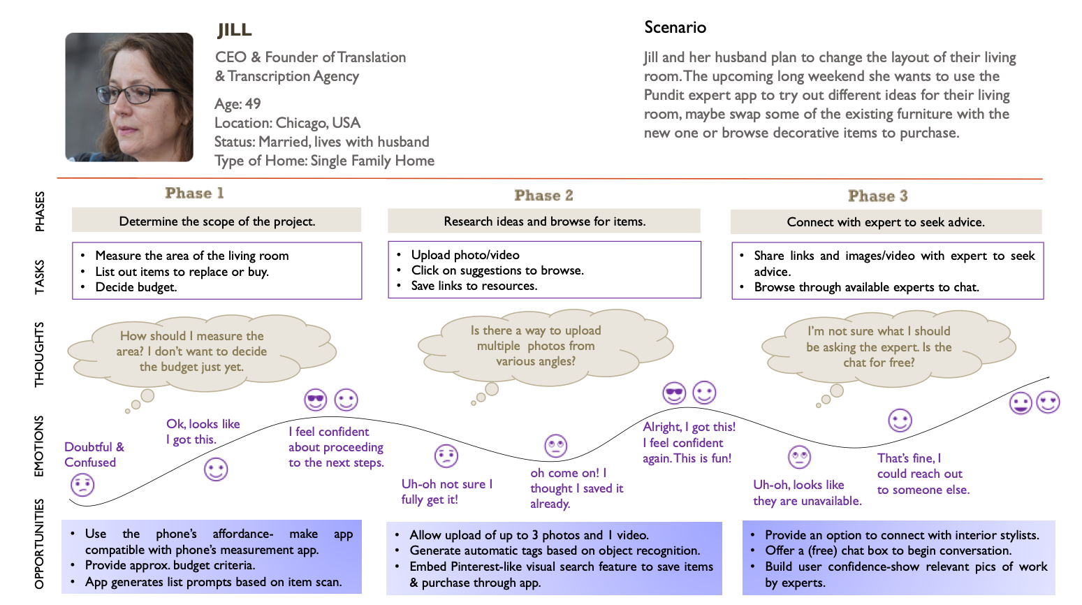
User Journey Map
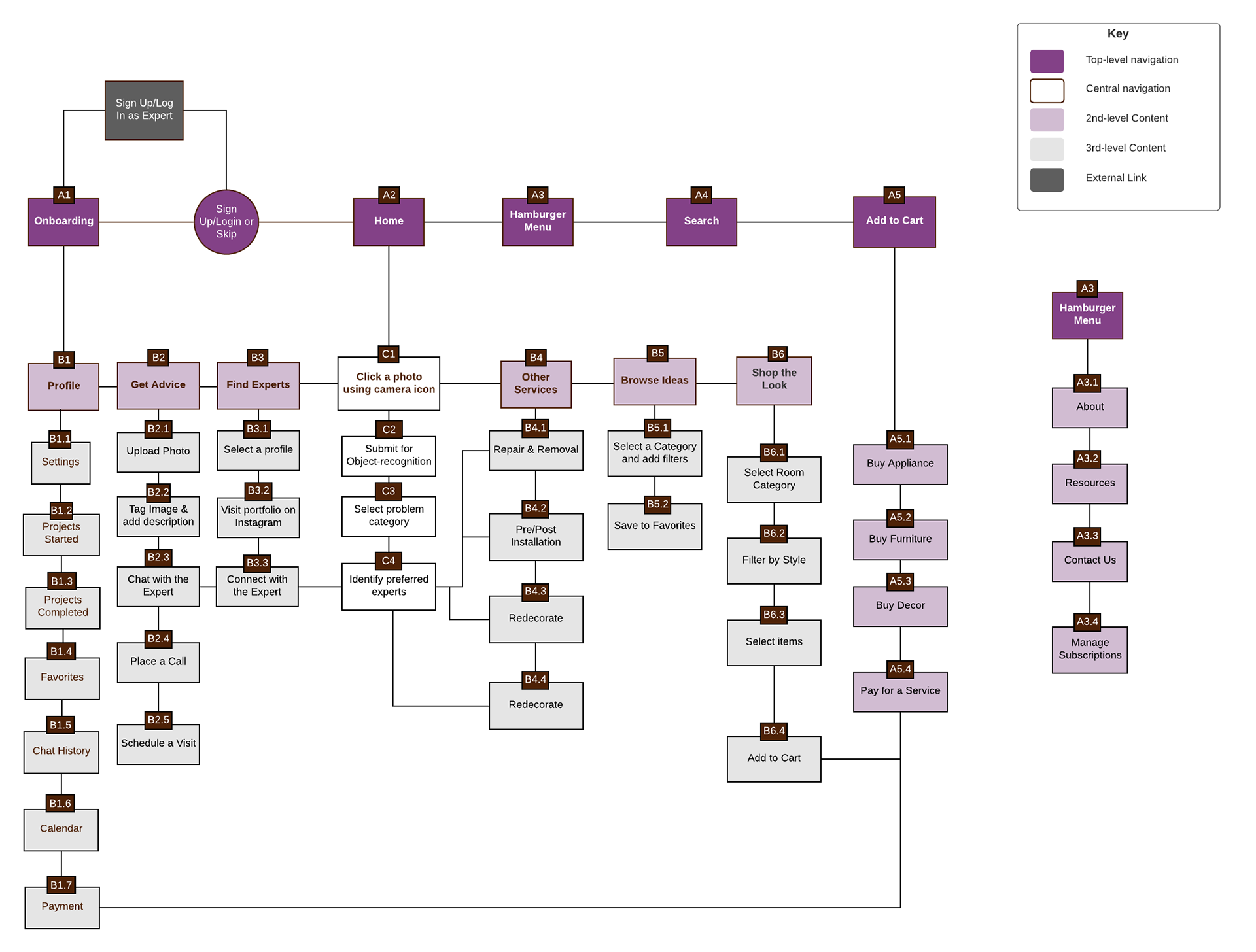
Card Sorting Analysis & Revised Site Map
Findings:
Based on how participants prioritized their cards into categories, I was able to verify whether my categories were appropriately articulated or whether they needed to be reviewed and restructured. Each category corresponds to the parent pages in the app. This was critical to determine before I went on to draft the site map for my app.
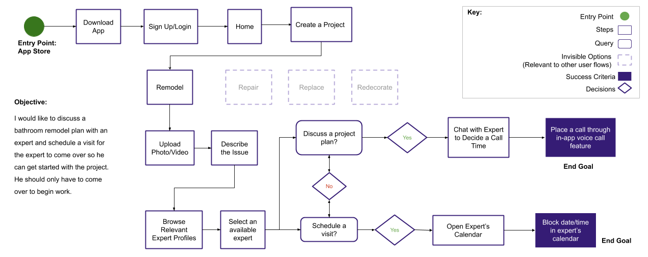
Task Flow
Keeping in mind core user needs I charted out this task flow for a remodeling project.
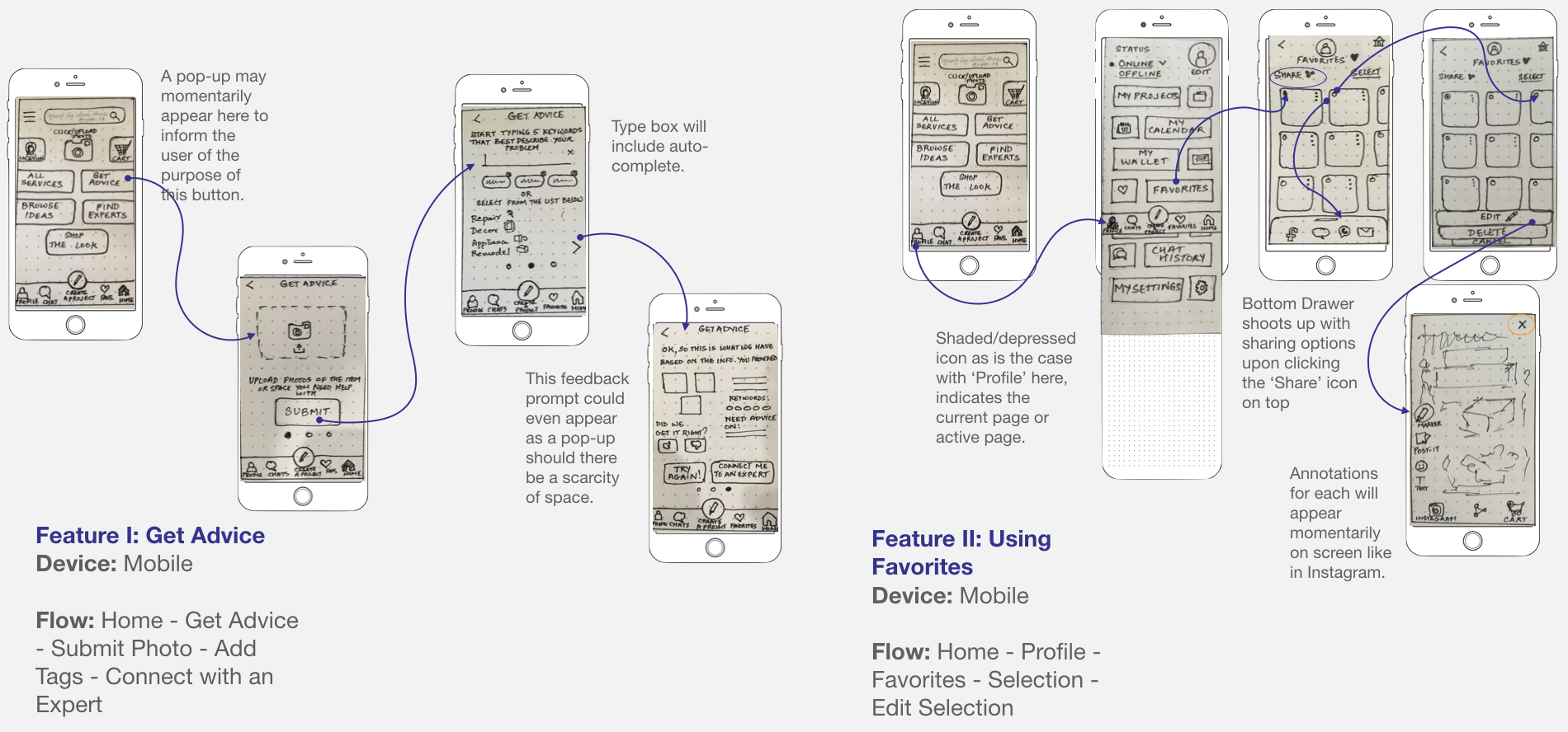
Paper Sketches (Low-Fi Wireframes)
While at this point, I had a very clear idea about the features I wanted to include, exactly how and where to include them was stilly partially a mystery. So I embarked on a journey of sketching, scratching out squeezing in details and re-sketching drawings. The arrows highlight the click zones throughout the flow.
Prototyping
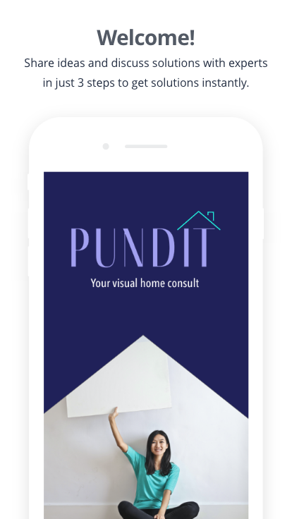
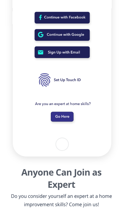
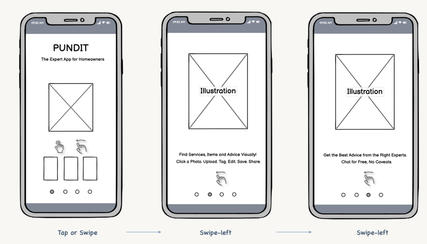
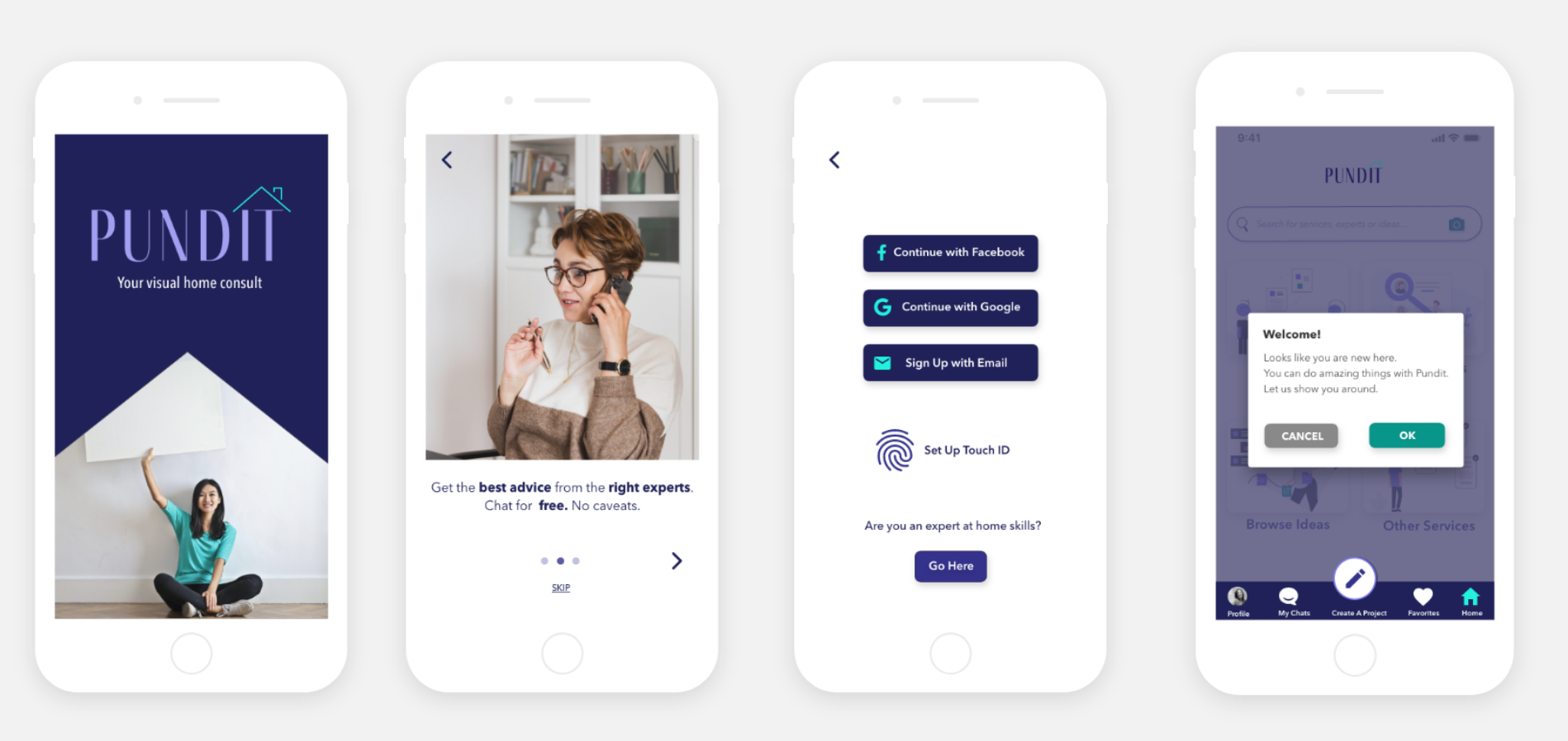
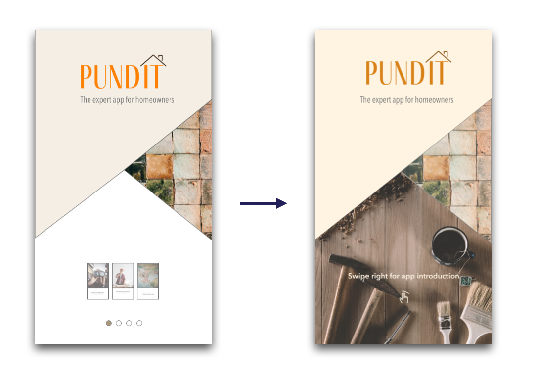
Designing the Onboarding Experience
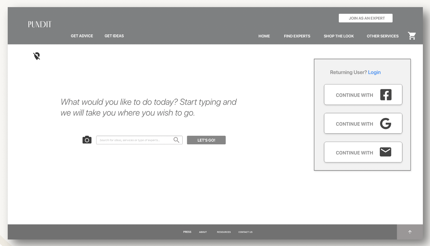
Mid-Fidelity Mockups for Desktop
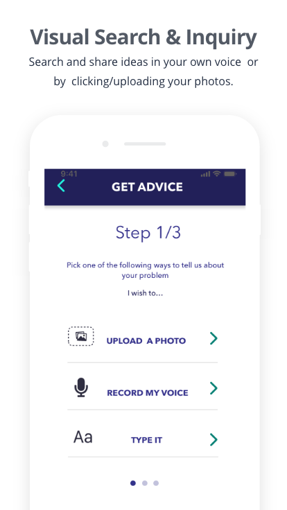
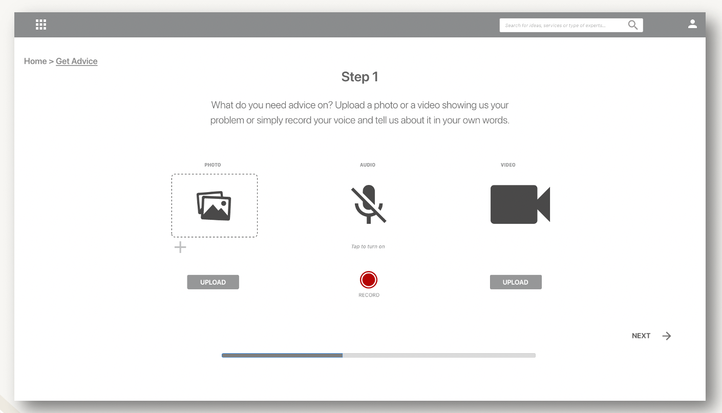
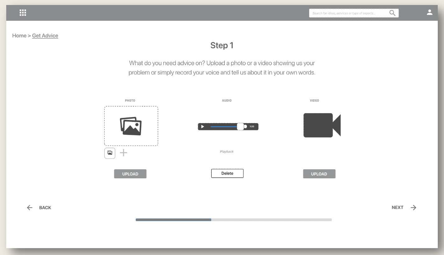
Curious to know how the designs would pan out on the big screen, I also designed a few screens for the Pundit web app. Visual, audio and video modes of problem solving in UX are becoming increasingly popular. My interviewees expressed needs about having powerful visual or voice interactions for speedy identification and resolution of their problems. So I figured it might be a good idea to have a video introduction to the app and offer customers both audio and visual modes of launching an inquiry.
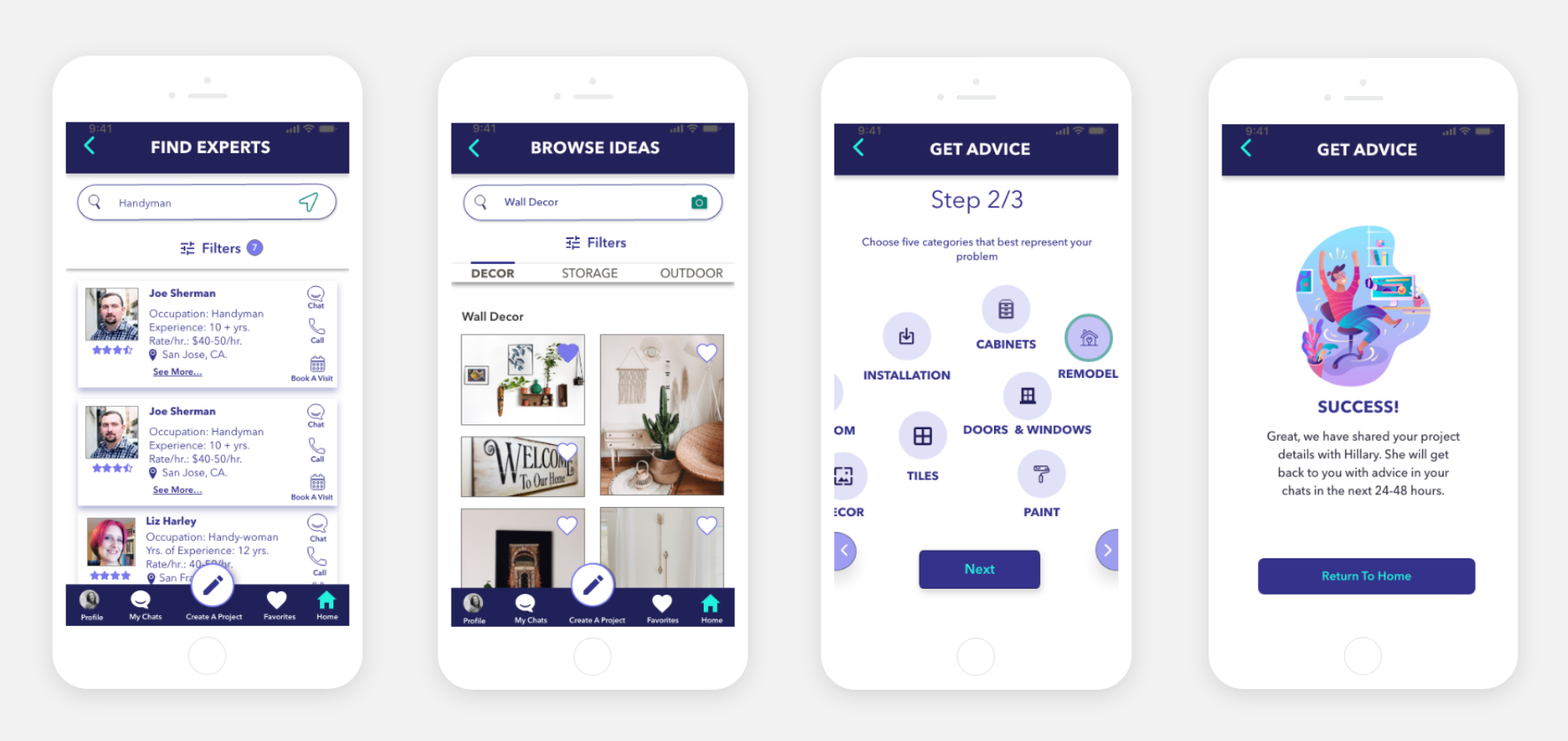
High Fidelity Prototypes
Measuring Success
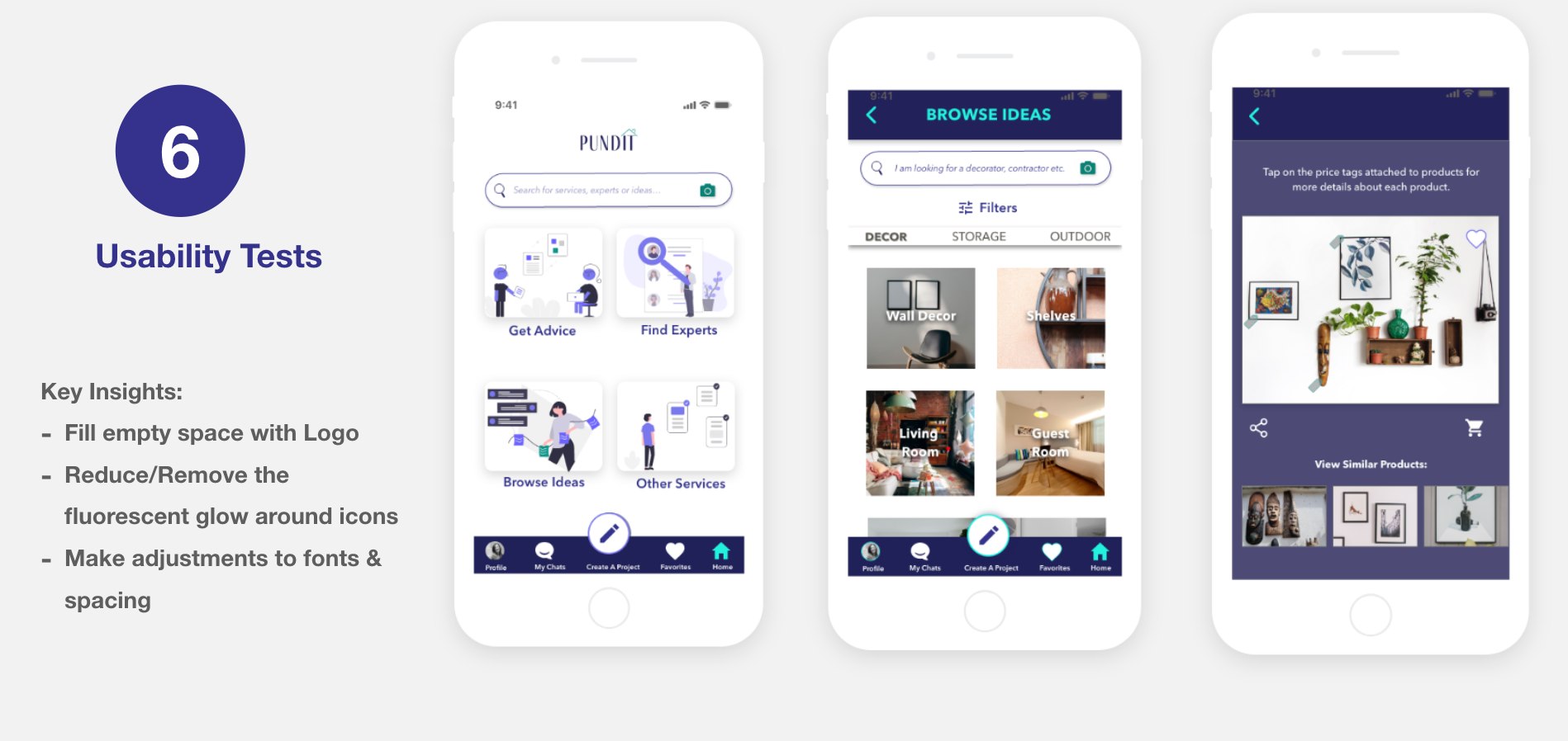
Usability Testing
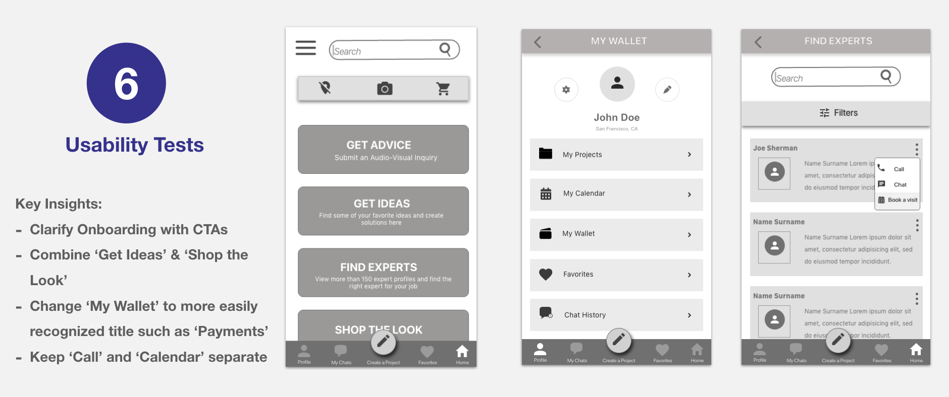
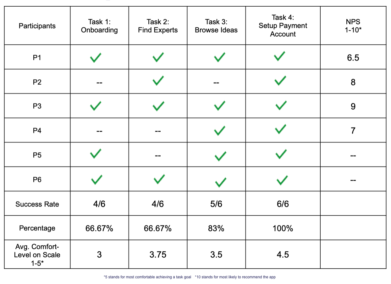
Task Completion Metrics & Key Issues
- 3 homeowners over 50 had problems understanding how to navigate onboarding. Another one was confused by the sight on 3 screens at the bottom of the splash screen
- To rectify this, I included an option to 'Skip' the introduction in addition to back and forward arrows that were missing earlier.
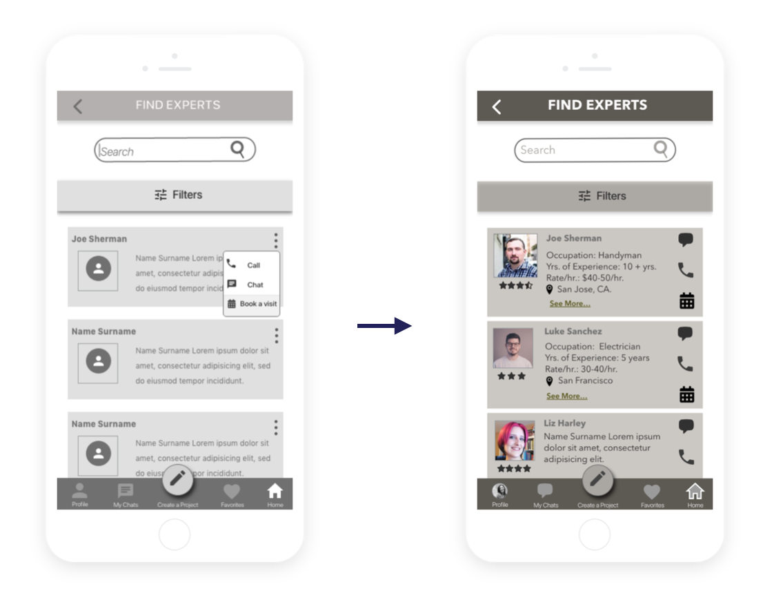
- Further, seeing that homeowners were keen to connect with a nearby expert instantly, I reduced a step by extracting the call and chat icons out of the triple dotted menu (which the users mostly glossed over) and included expert's location on each card.
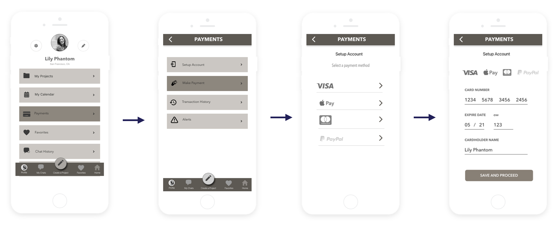
- Lastly, 'My Wallet' was changed to 'Payments' to make it simple and easily relatable. I also added a page offering mode of payment options including Apple Pay.

Testing with Hi-Fidelity Prototypes
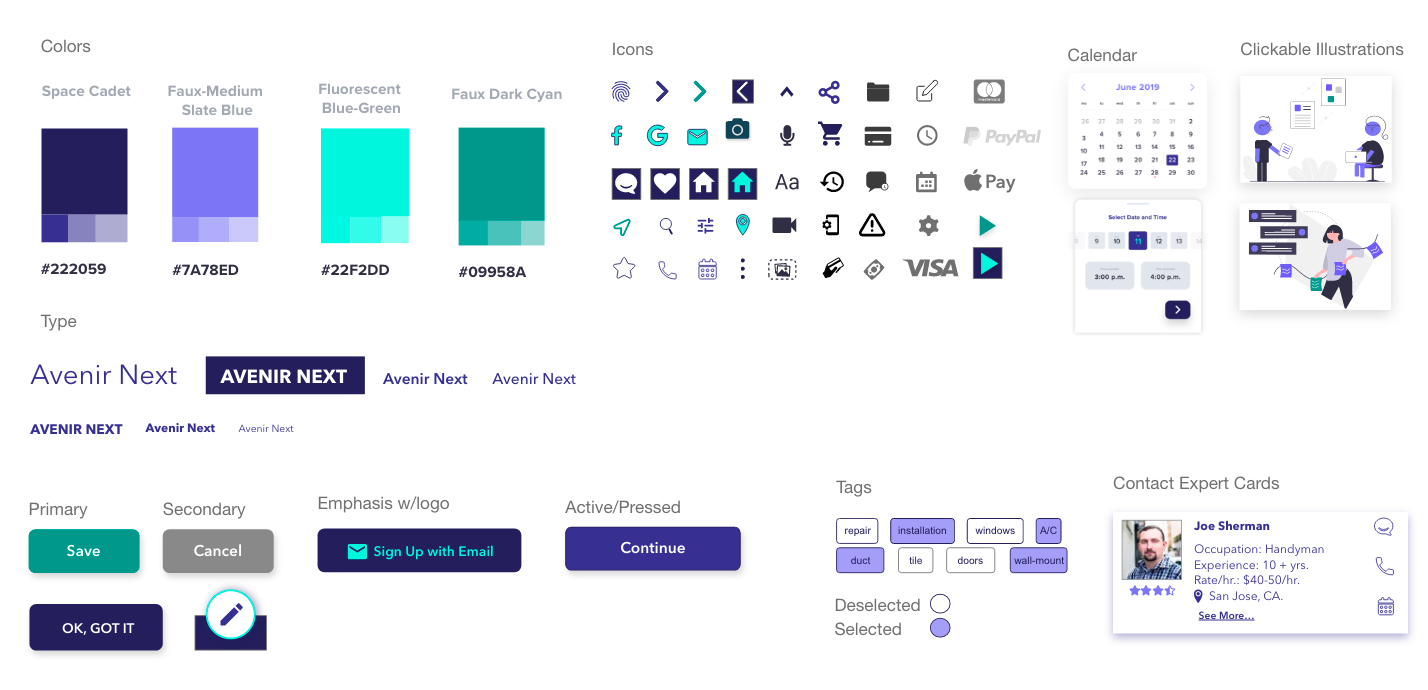
Style Guide
Key Takeaways:
- In 6 months Pundit has steadily evolved to become a development-ready mobile application
- Limited budget and resources made it challenging to find participants for study. However, I cast my net wide to sift through potential customers and tapped into my networks to find homeowners that provided critical insights to design the app and improve its usability.
- Besides researching the market, analysis and synthesis of information obtained from interviews and testing, some of my other favorite parts of this project have been wireframing and prototyping.
Next Steps:
- Conduct another round of usability tests to validate the usability of newly designed screens
- Developer hand-off of mock-ups and MVP launch plan.
- Survey with homeowners and pros to validate product pricing plans
- User acquisition strategy formulation
- Go-to market strategy and marketing outreach